2023
WEBSITE
Shopify Storefronts
Role
Lead Designer
Project type
Landing page
My contribution
Art direction
Page layout & design
Experience
Project team
Lucy List, Eric Johnson, Evany Thomas, Nabeel Pervaiz, Carolyn McNeillie, Dave Meisner
Visit Site
The heart of every merchant's online presence, regardless of their size or scale, is their Shopify Storefront. This public-facing platform is where customers interact, browse products, add items to their cart, and ultimately, make their purchases. It's a dynamic space that requires constant optimization and updates to ensure it remains effective and engaging.
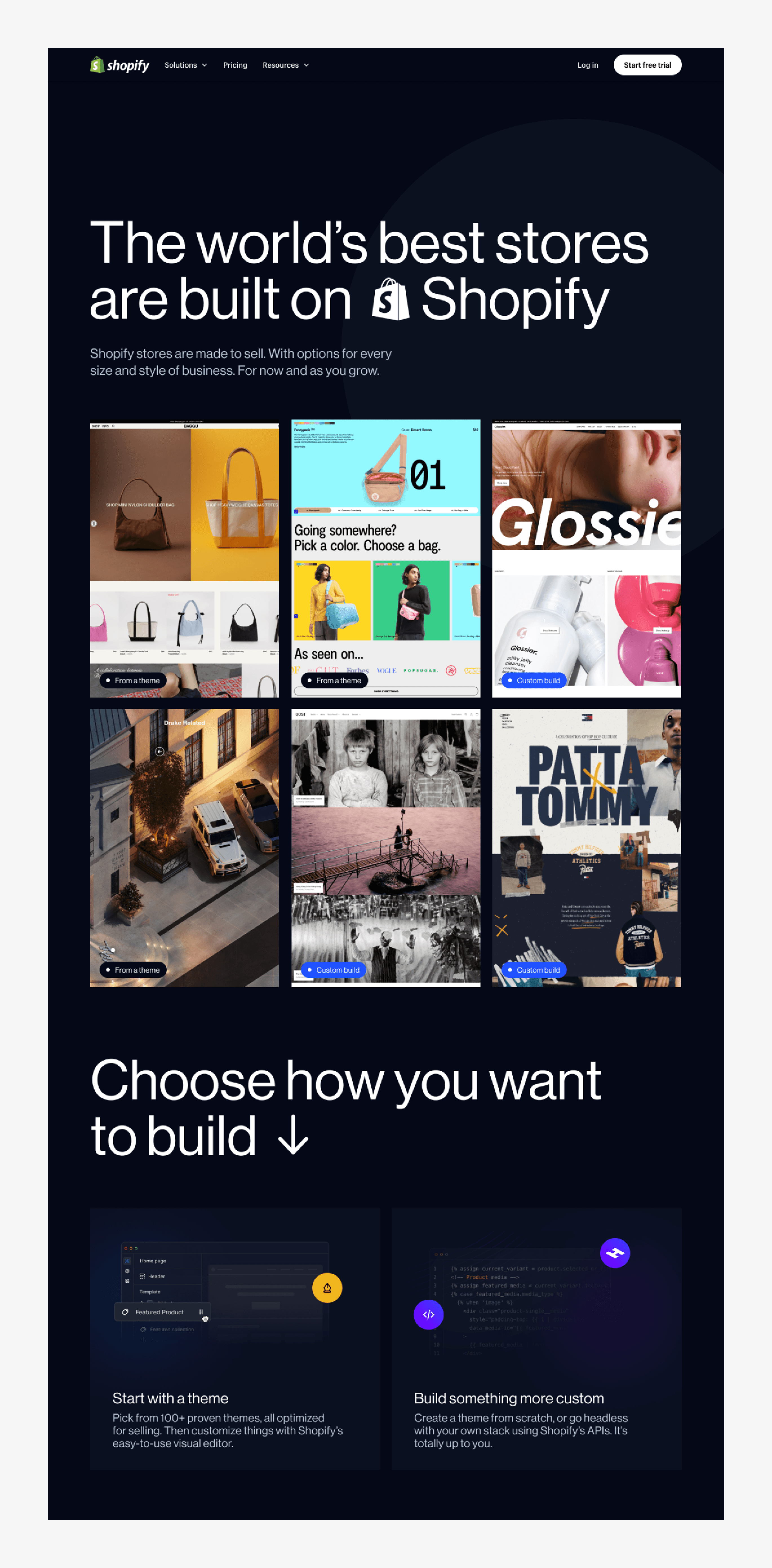
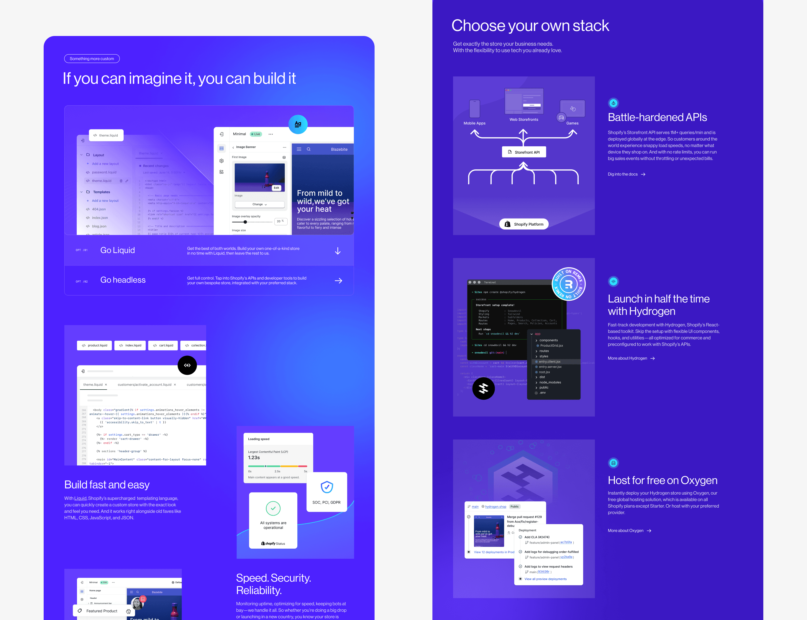
This project aimed to simplify this process by providing a comprehensive landing page that caters to two distinct audiences. The first group comprises individuals who are just starting out and prefer to use a premade theme to establish their online presence. The second group is more technically inclined, with experience in development or access to developers proficient in Liquid and Hydrogen for a a more customized approach.
We wanted to give prospective merchants a clear roadmap on how to start, build, and scale their Shopify storefront. A storefront is more than just a sales platform; it's a unique narrative of a merchant's commerce journey shared with the world. It's their digital home on the internet.
Content design
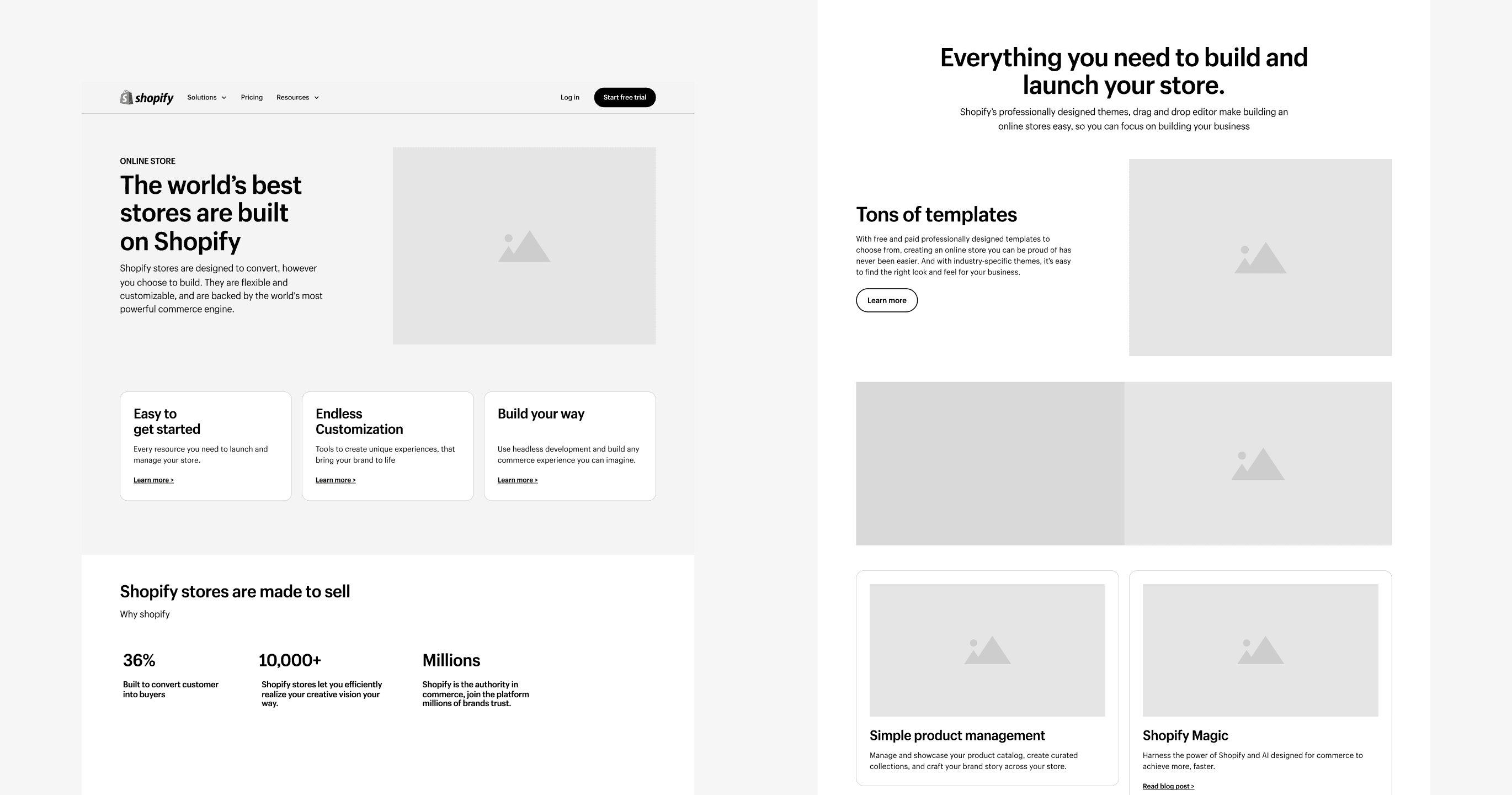
A key aspect of this project was our close collaboration with content design. After initial discussions with product marketing, we identified the features we needed to highlight and established a high-level narrative for the page. This formed the basis of our collaboration with our content designer, who played a crucial role in refining the page and ensuring the story flowed logically from start to finish.
Throughout the process, we maintained a keen focus on our two primary audiences: merchants who were just embarking on their e-commerce journey and those with more advanced needs, with access to development resources for a more custom solution. This collaborative approach between design and content design allowed us to constantly iterate and refine our work, resulting in a page that effectively communicates relevant information to prospective merchants at different stages of their e-commerce journey.
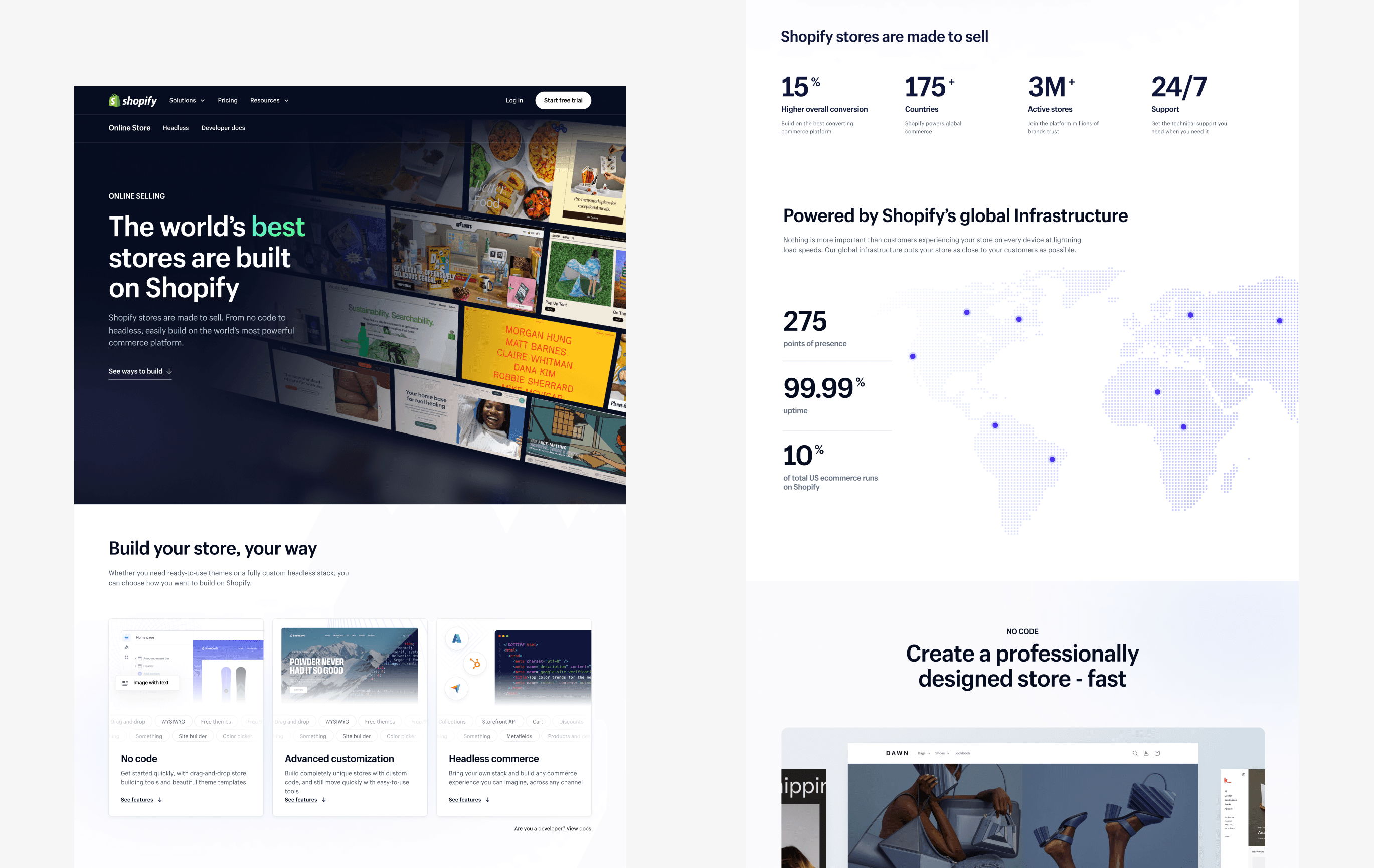
Visual Explorations
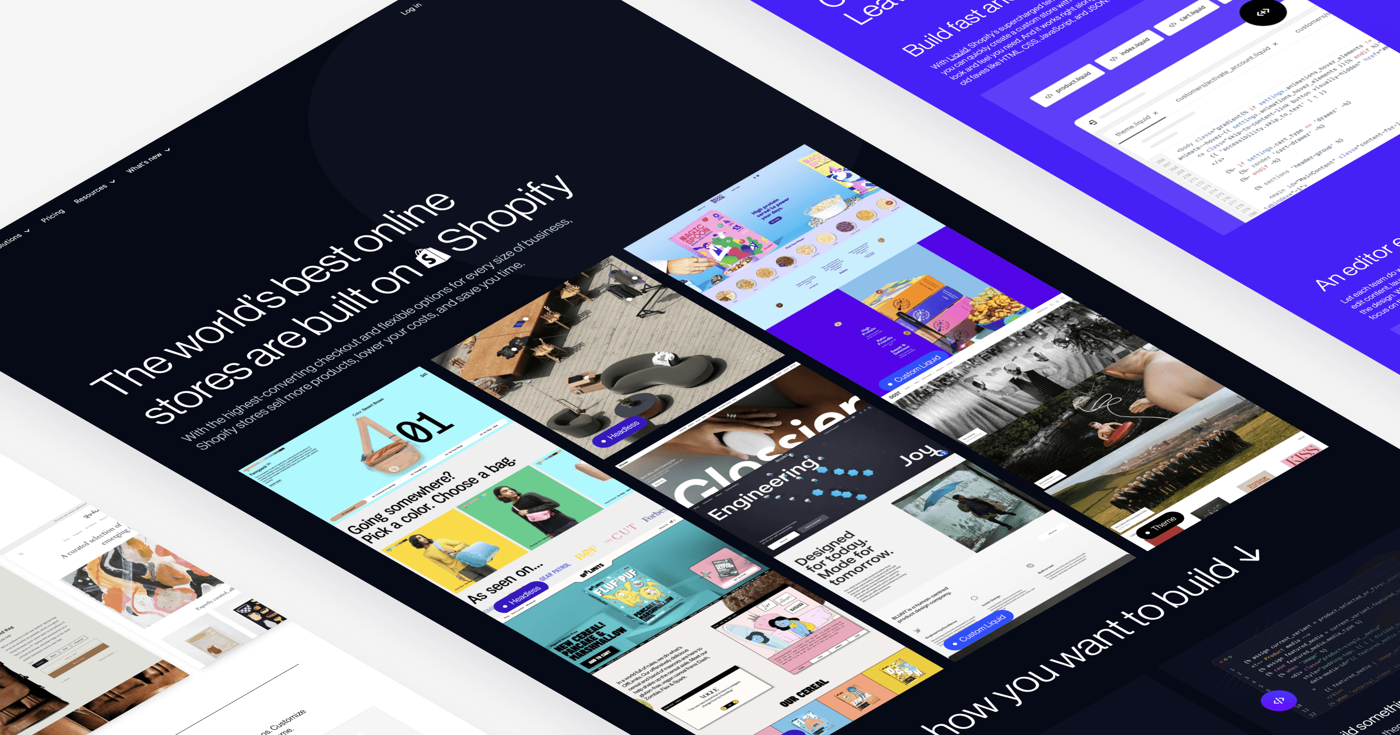
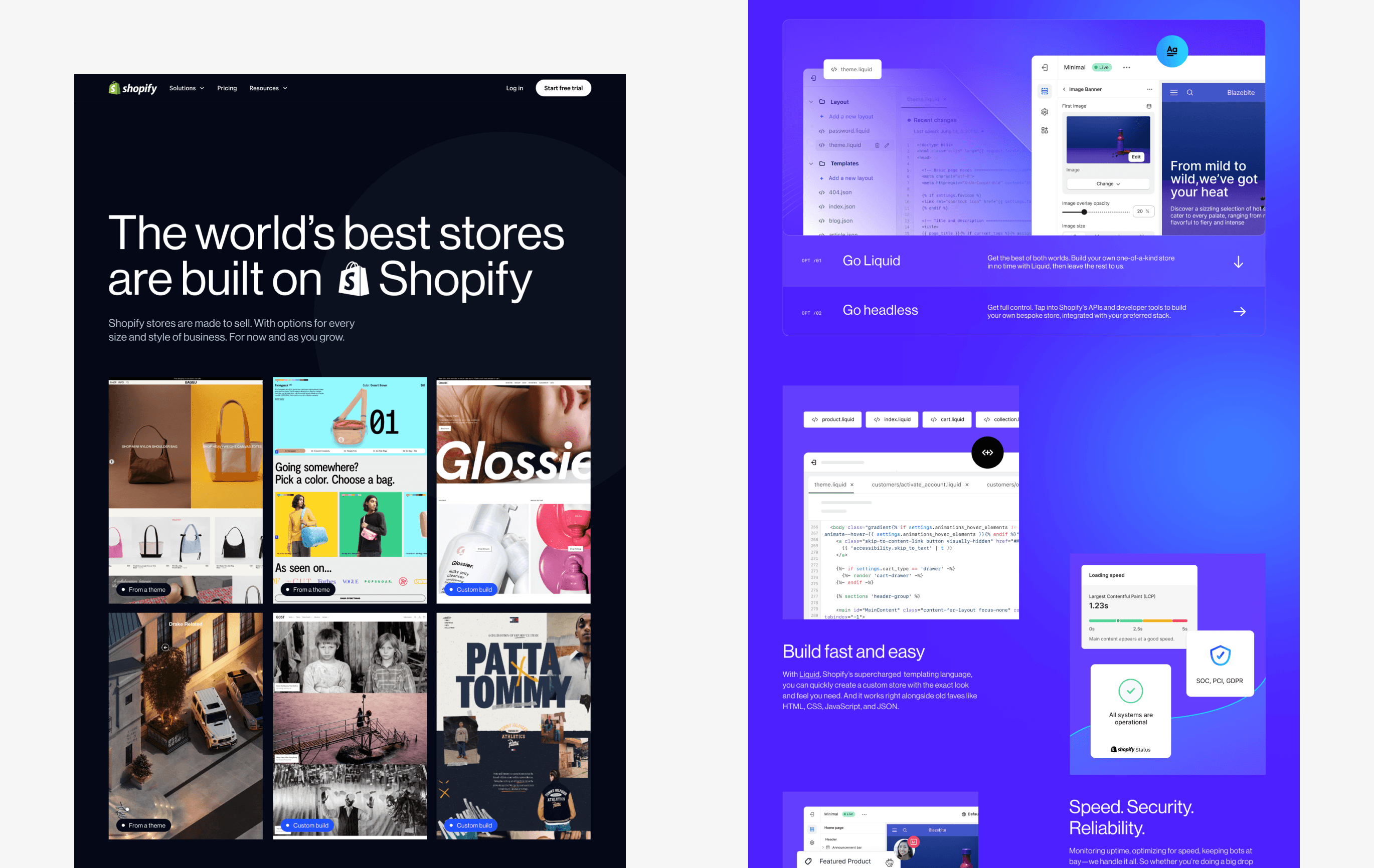
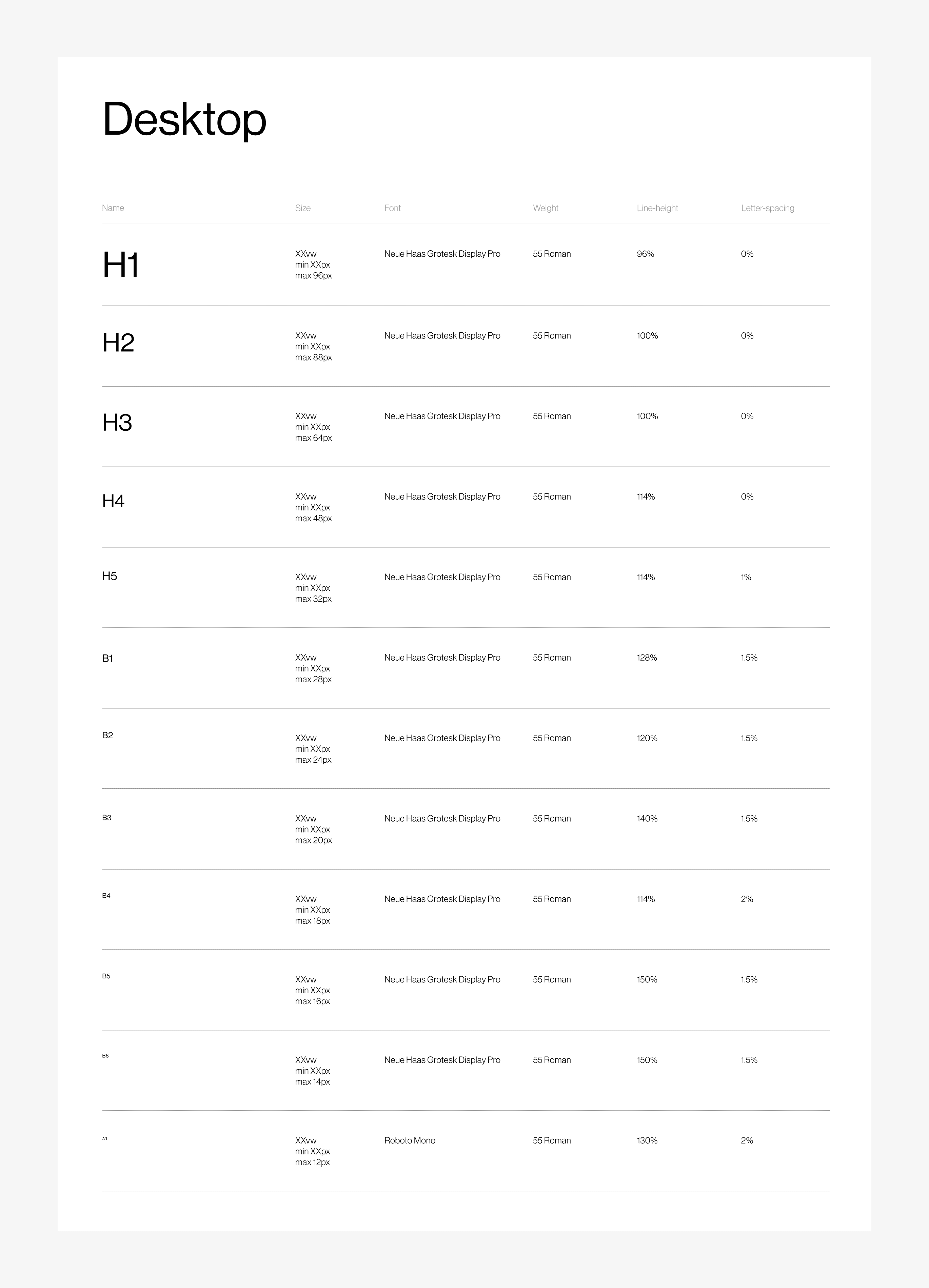
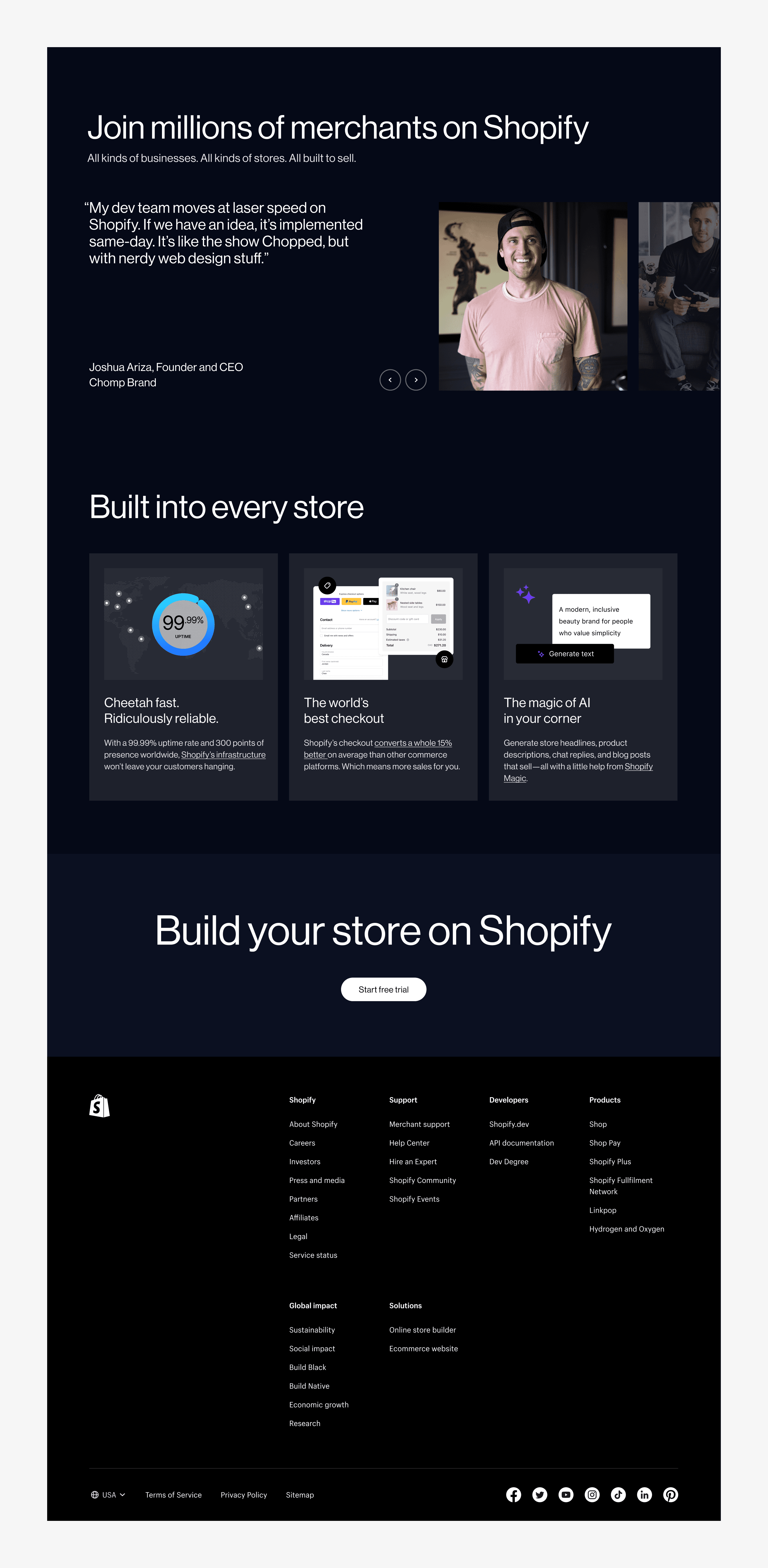
In designing the layout of the page, our aim was to craft a bespoke experience that incorporated elements of motion and interactivity, utilized a new typeface, and featured custom components. After extensive exploration, we settled on an editorial style that leveraged large type, a limited color palette, and generous white space. We also broke away from the traditional grid layout to inject more interest and dynamism into the design.
However, our primary objective was to ensure that the design did not overshadow the content. We wanted the design to serve as a subtle backdrop, allowing our themes, products, and features to take center stage. The emphasis was placed firmly on the content itself, ensuring that the user's focus was drawn to the information we were presenting. This approach required a delicate balance between creating an engaging design and not detracting from the core message of the page.
Hero exploration
Challenge
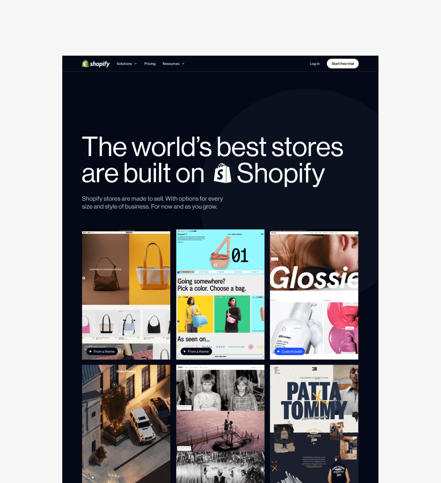
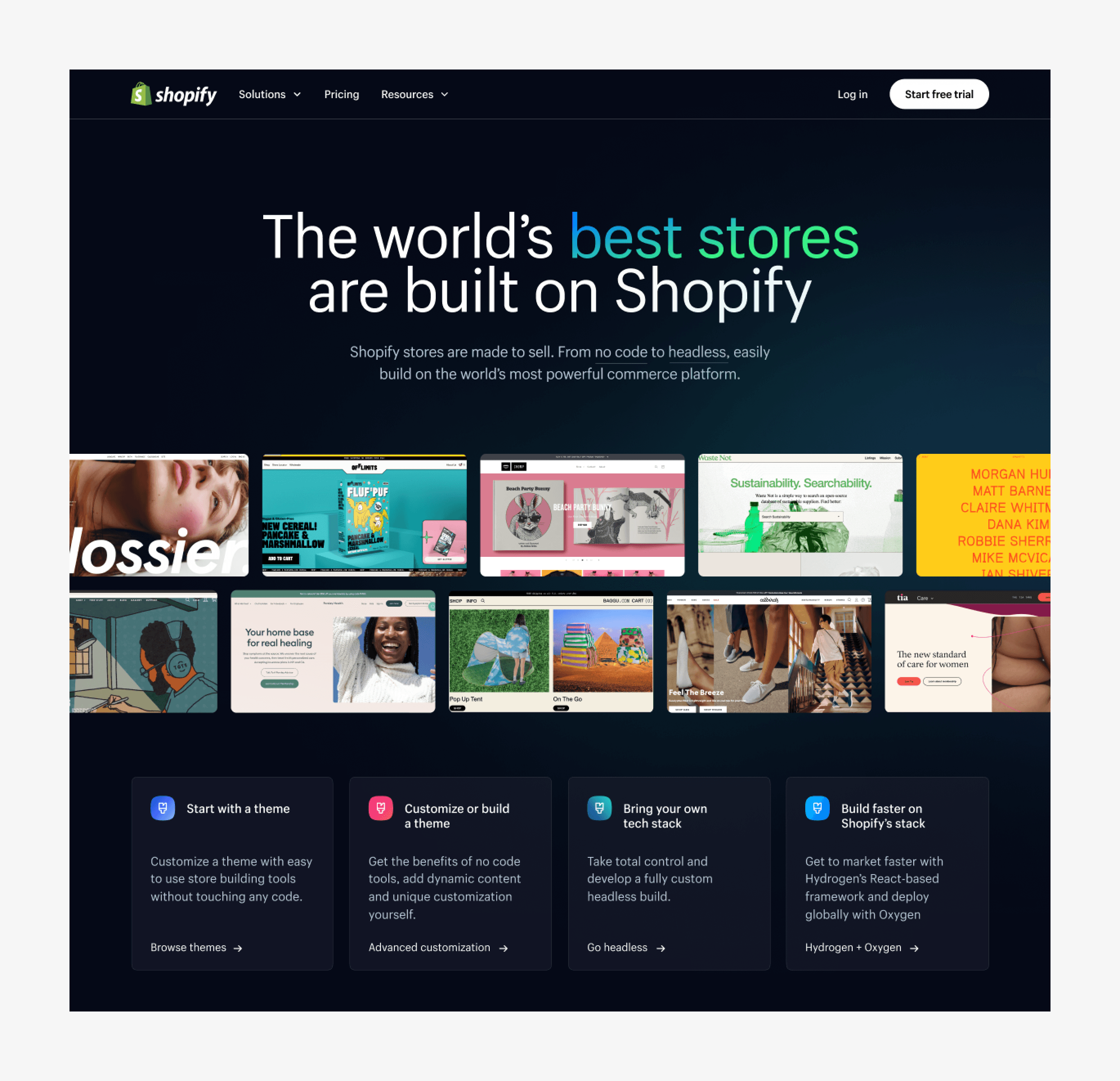
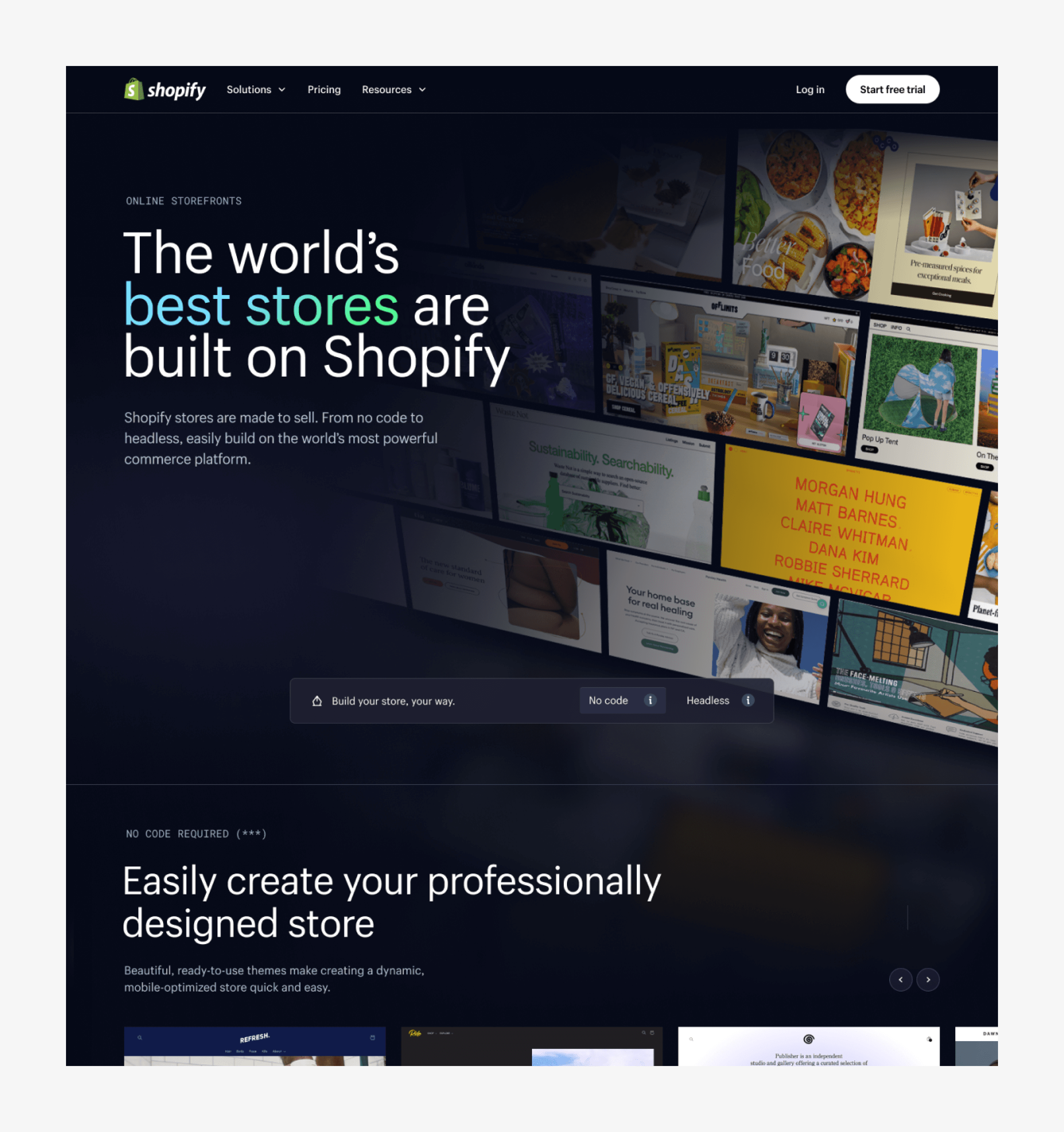
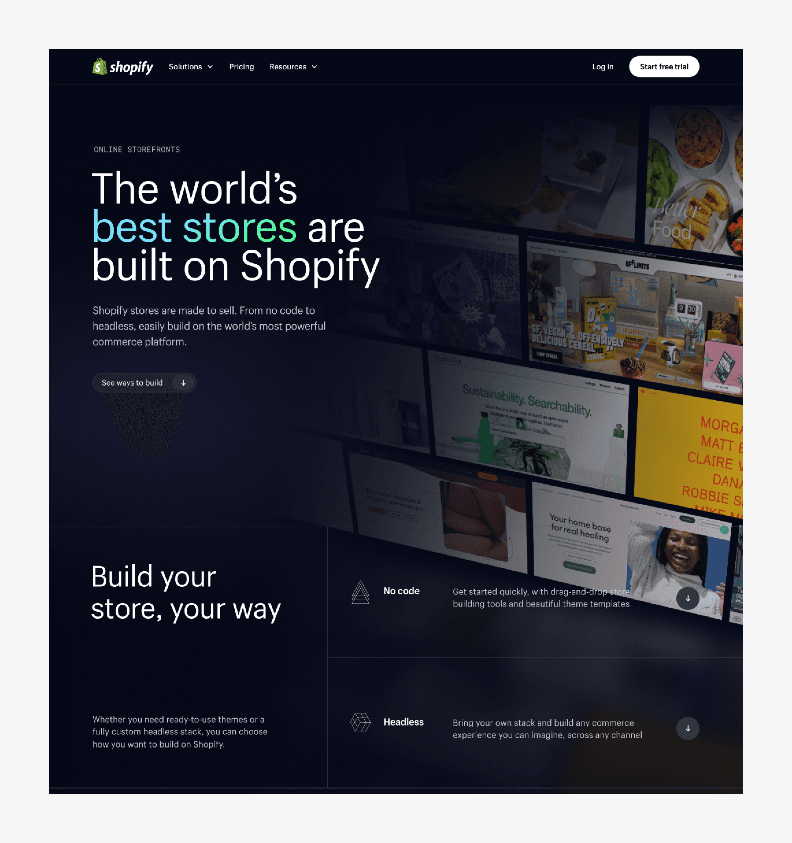
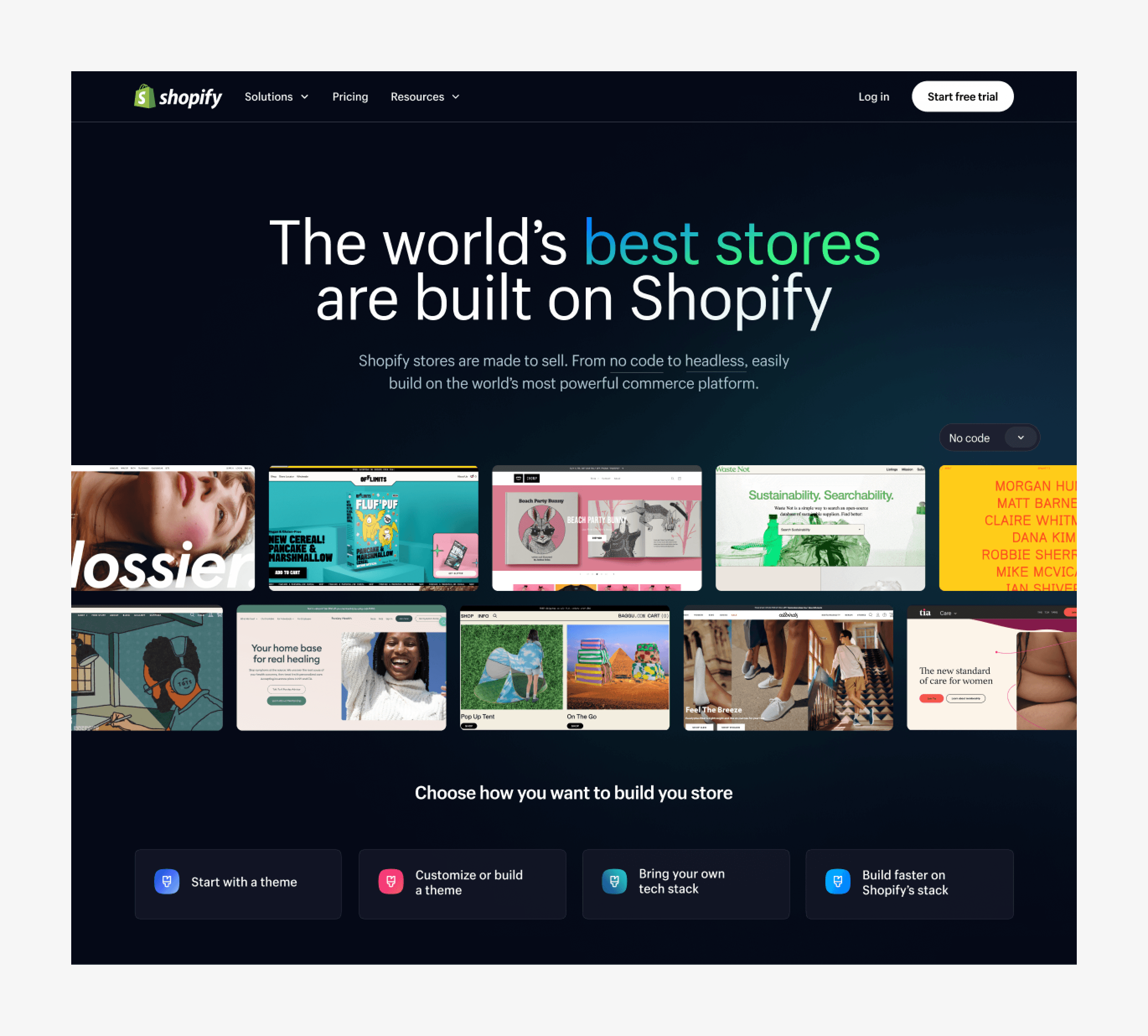
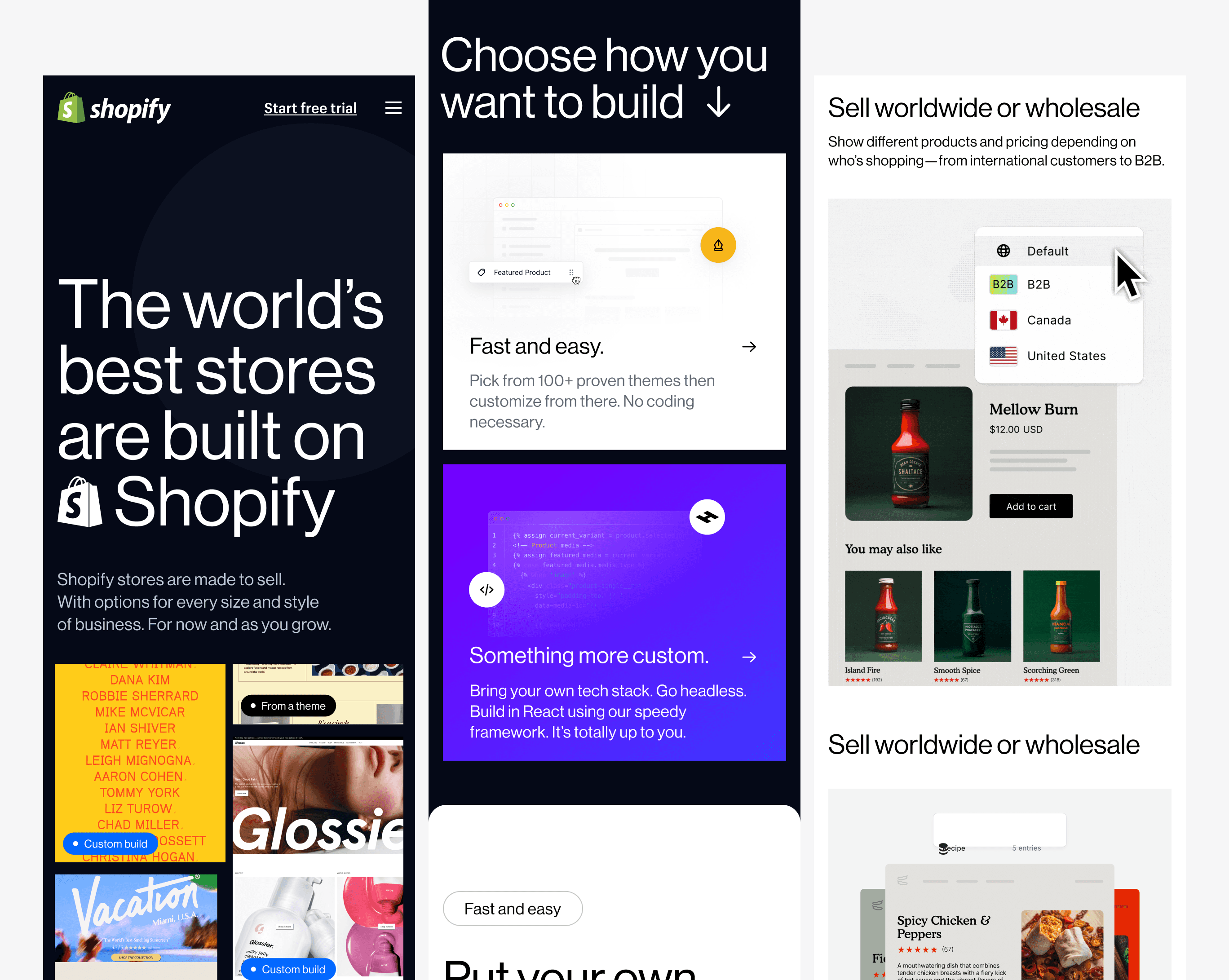
One of the challenges we encountered during this project was the representation of a diverse range of merchants in the hero section. We aimed to showcase a spectrum of users, from those utilizing free themes to those employing Liquid themes and headless builds with Hydrogen. Moreover, we wanted to highlight aesthetically pleasing website builds, not just recognizable brands.
The process of vetting and reaching out to merchants was time-consuming and often did not yield immediate results due to non-responses, legal negotiations, and tight timelines. We initially started with over 80 merchants and, after extensive deliberation, narrowed it down to 12 to feature in the hero section.
After much back and forth, we managed to feature a balanced mix of merchants, from those just starting their journey to more established enterprises like Glossier. This diversity ensures that any visitor to the page can identify with at least one of the merchants, helping them envision how Shopify could be a great fit for their own needs.
Product representation
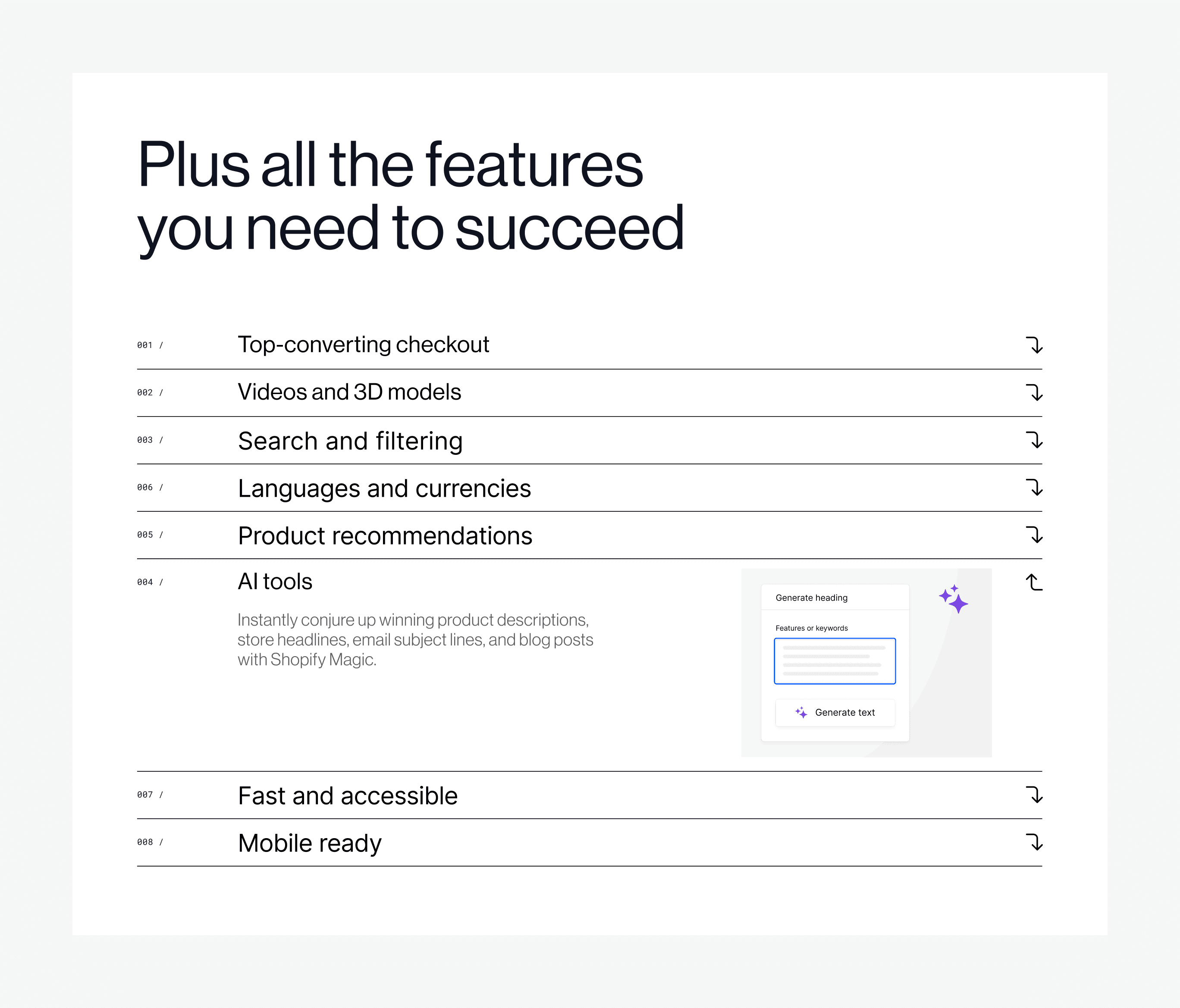
Another significant challenge we faced was the 'show, don't tell' aspect of our product. Given the complexity of our product, we aimed to present it in a manner that was both honest and visually appealing. To help users better understand and grasp the product, we utilized motion, a strategy that came with its own set of challenges.
In the past, our use of pared-down UI in motion graphics, while aesthetically pleasing, did not always provide an accurate representation of the product. Furthermore, non-expressive motion made animations easy to overlook or scroll past.
For this page, we aimed to provide a 1:1 representation of the admin interface to assure users that we were not oversimplifying the product's complexity. We introduced expressive motion to infuse character and playfulness, ensuring the experience didn't feel like a mere screen share. Quick zooms and pans were used to eliminate unnecessary UI elements, providing a more streamlined and honest view of the product. Balancing the need for an accurate representation with a visually engaging presentation was a challenging yet crucial aspect of this project.
Something more custom
Responsive
Results
The results of our project have been highly encouraging. Within the first month alone, we recorded 287,175 unique page views, with visitors spending an average of 4 minutes on the page. We also saw a significant increase in engagement, with "start free trial" clicks rising by 4.5%.
While we continue to monitor the page's performance over the coming months, the initial feedback has been overwhelmingly positive. The page has been well-received both internally and externally. Internally, there has been talk of elevating our design across marketing initiatives to match the caliber of this page. This project set a new benchmark for our design standards, and we look forward to seeing its long-term impact.
