2024
WEBSITE
Shopify Homepage
Role
Lead Designer
Project type
Landing page
My contribution
Art direction
Page layout & design
Experience
Project team
Lucy List, Eric Johnson, Evany Thomas, Nabeel Pervaiz, Carolyn McNeillie, Dave Meisner, Nik Dudukovic, Arnaud Tanielian
Visit Site
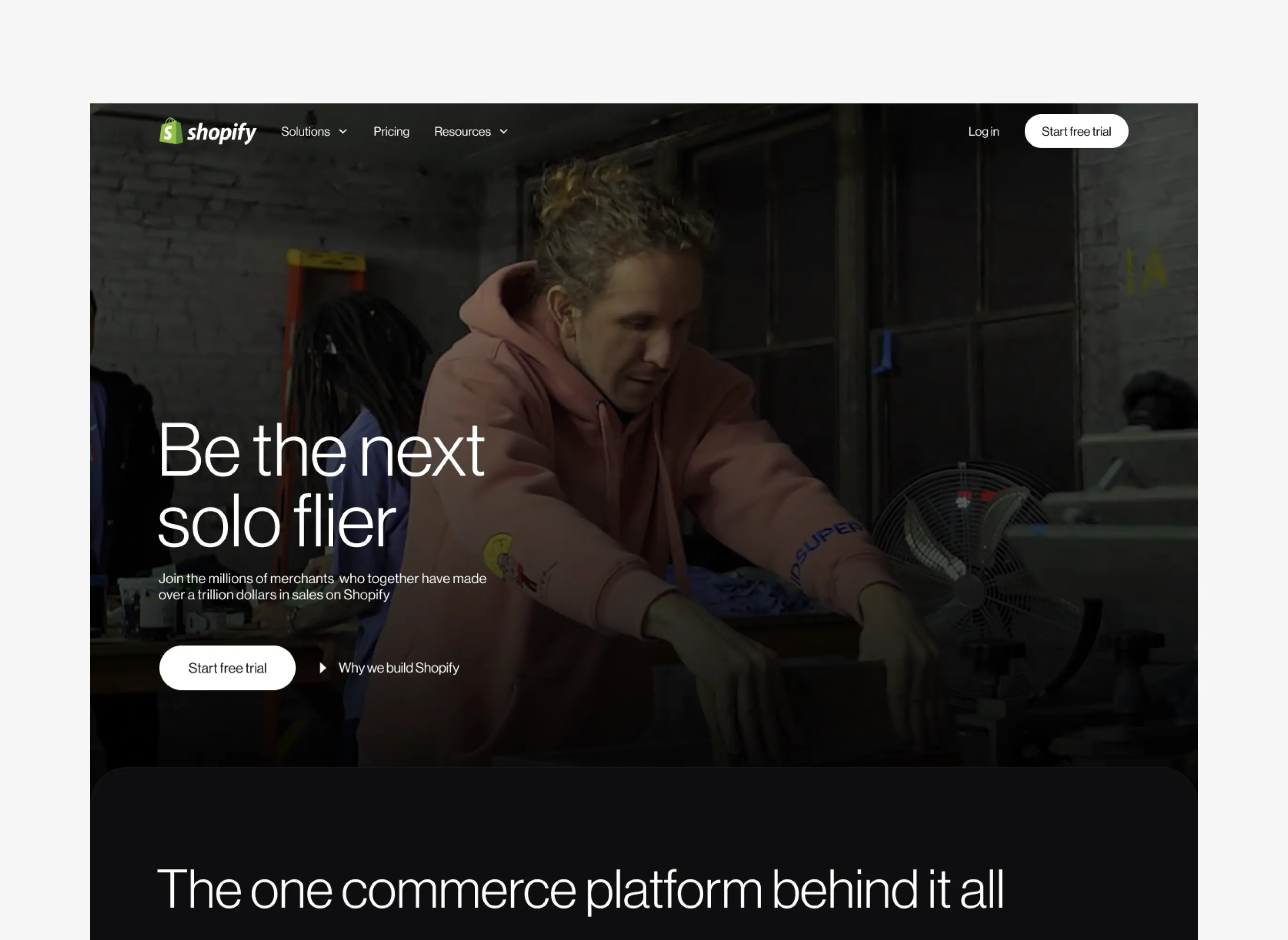
As Shopify grew its product offerings and expanded its target audiences, our homepage started to feel outdated. It was built on an information architecture designed for a much smaller product portfolio, aimed at a narrower customer base. The result? A page that no longer reflected the full scope of what Shopify could do or told the story we wanted to share with our diverse range of users.
With the redesign, we set out to build a homepage that speaks directly to all Shopify audiences—entrepreneurs, small and medium businesses, enterprise brands, retailers, developers, and even buyers. Our goal was to create a clear, compelling, and fresh experience that not only showcases what Shopify offers but also guides each visitor on a path to learn more and take action. By tailoring the messaging and structure, we wanted the new homepage to trumpet what sets Shopify apart and help each audience understand why it’s the best solution for them.
Content design
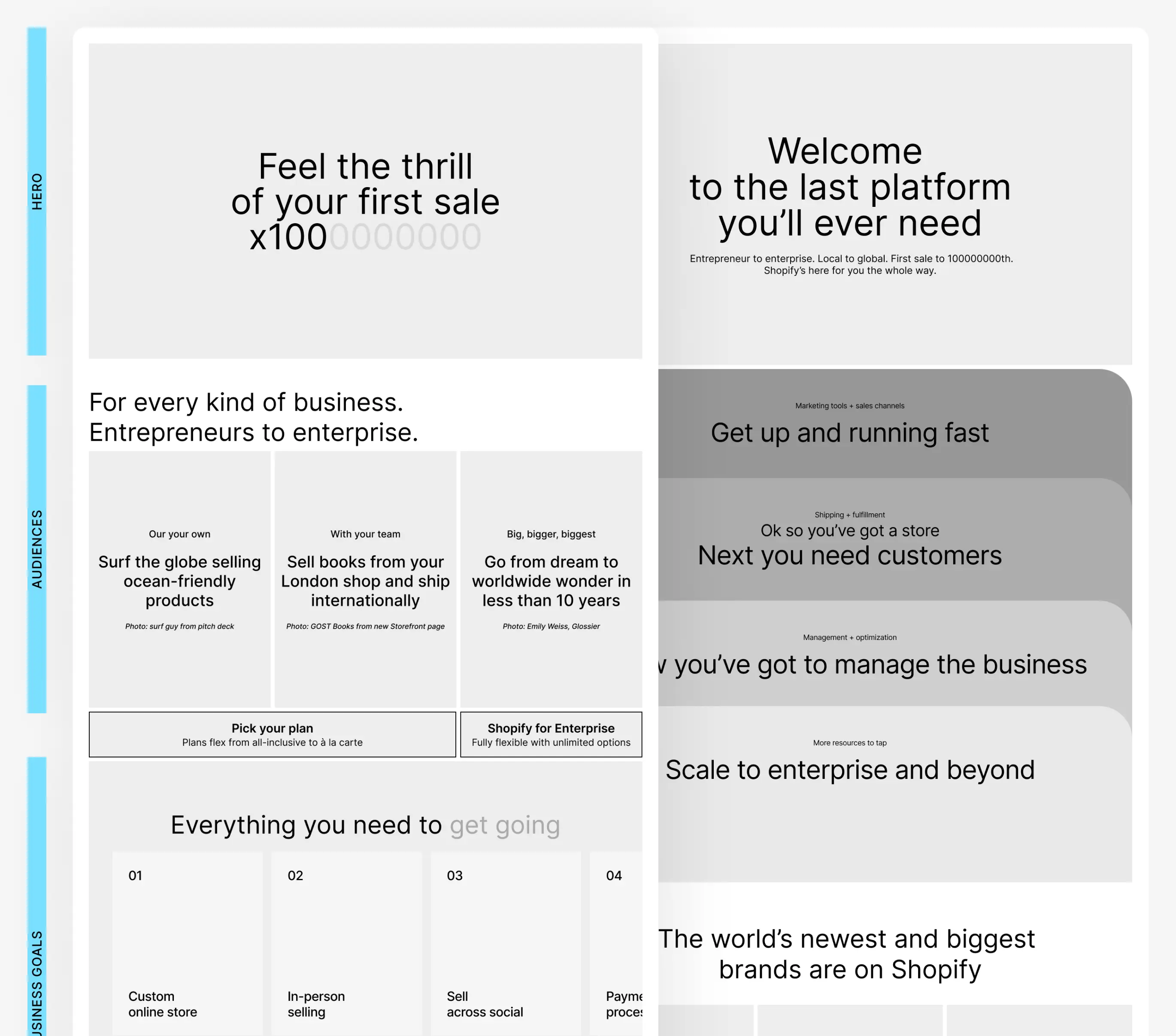
We kicked things off by focusing on content design, figuring out our messaging goals, and diving into what research showed us about our audience. We looked at a variety of approaches—functional, emotional, conversational—you name it. But ultimately, we wanted to nail down three things: what Shopify offers, what makes us different, and why we’re the best solution for starting a business.
Our audience comes to the homepage with questions—what is Shopify, how does it work, and what do I get out of the box? Whether they’re budding entrepreneurs, SMBs, enterprise brands, or developers, our goal was to make sure anyone with an entrepreneurial mindset could find what they need and get directed to the right places to learn more.
One of our guiding principles was “show, don’t tell” when it came to product offerings. We wanted to break away from what’s expected—knowing that some people might hate it, but the right people would love it. In the end, we wanted to make sure our content story was airtight before jumping into any visual explorations.
Design exploration
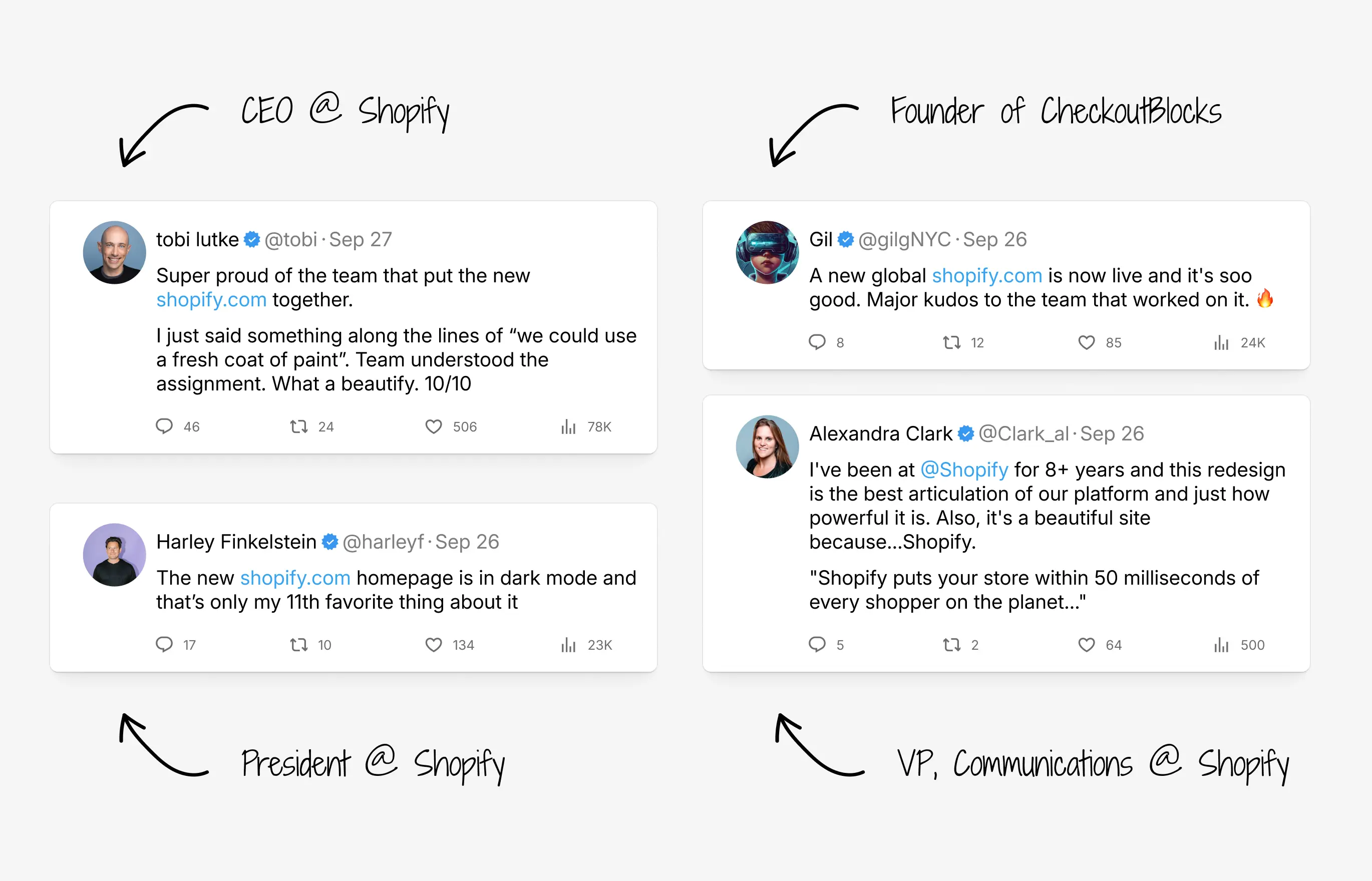
Shopify intentionally doesn’t have a defined "brand"—this comes directly from the CEO. He’s all about being different, making the internet fun, and avoiding the cookie-cutter look. As a developer himself, he’s constantly thinking about how to make our online presence stand out in a unique way. While this is exciting, it can also be a bit of a challenge internally.
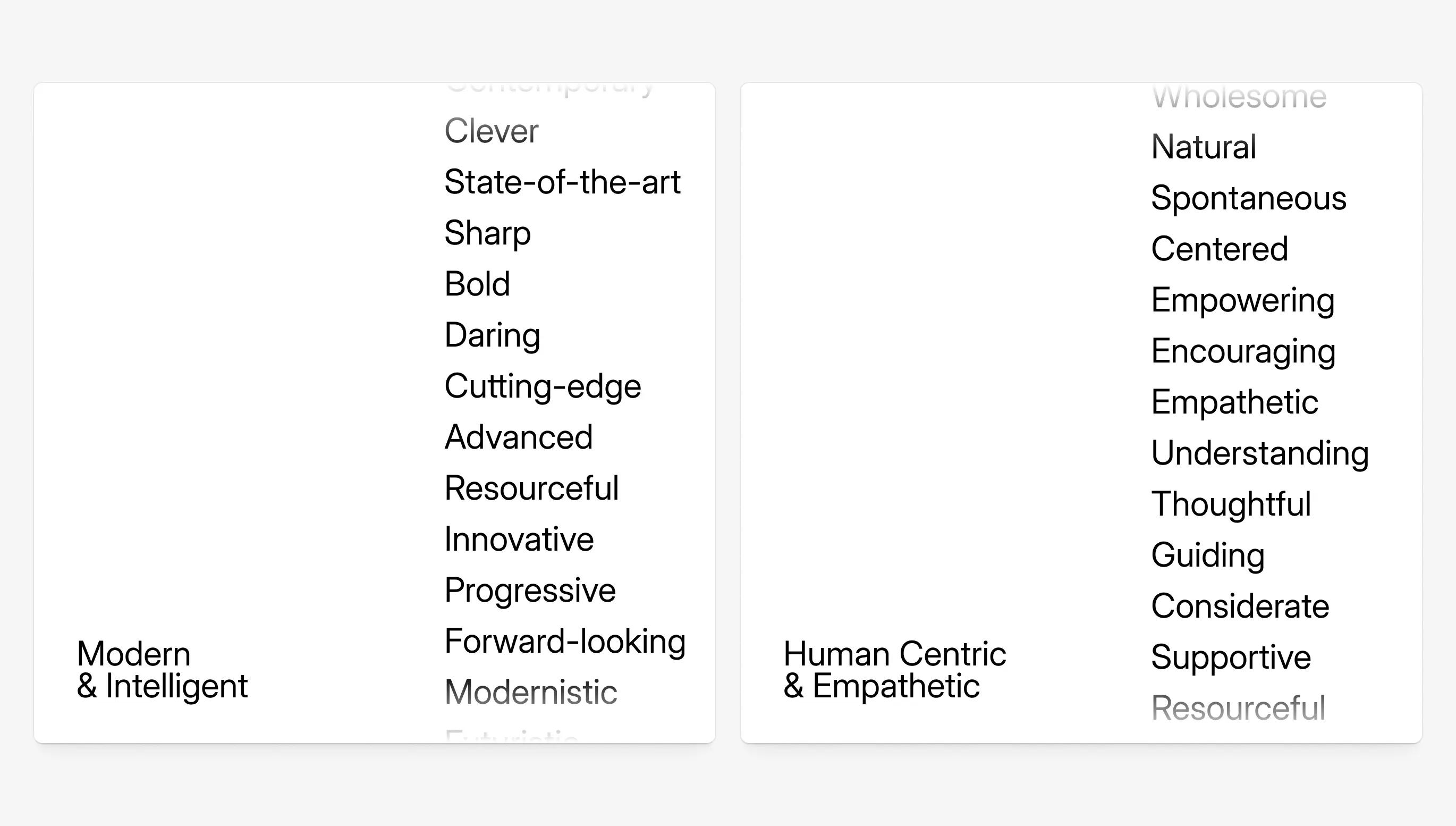
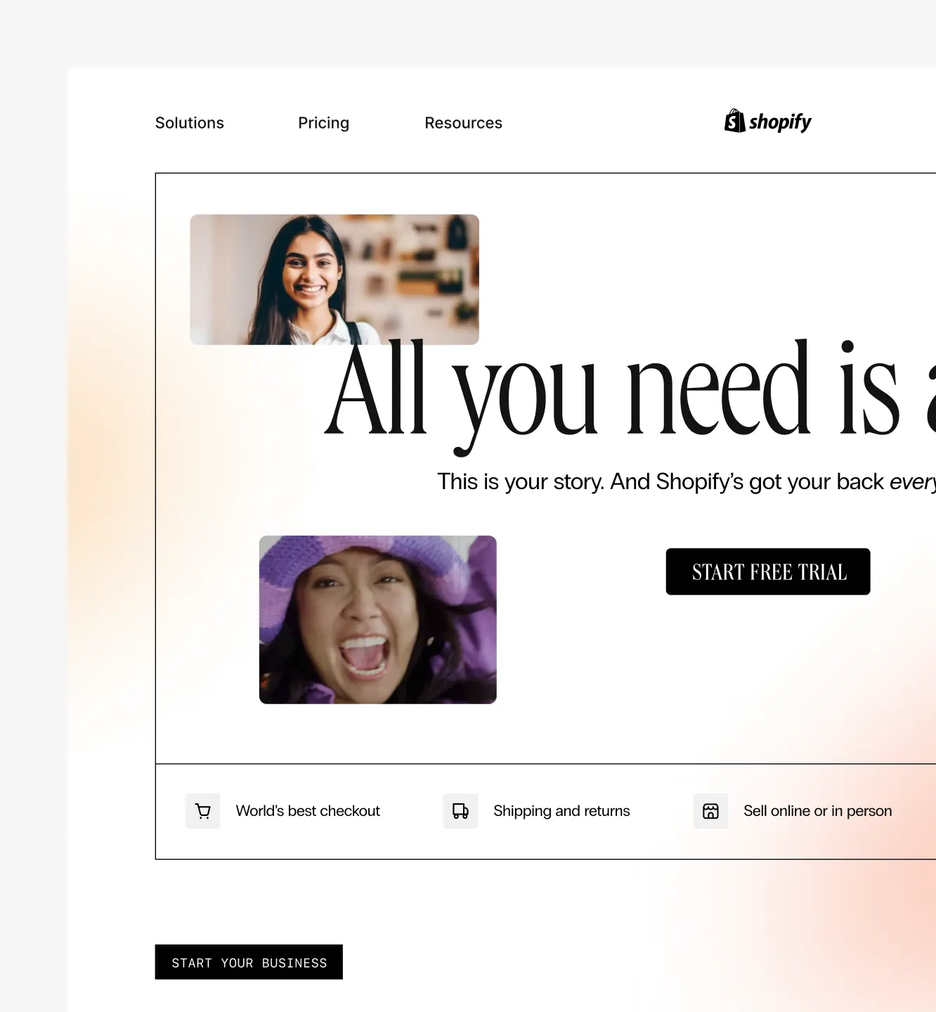
For this project, we started by pitching two concepts to stakeholders: “modern and intelligent” and “human-centric & empathetic.” Both had strong potential even with different design styles.
Design direction
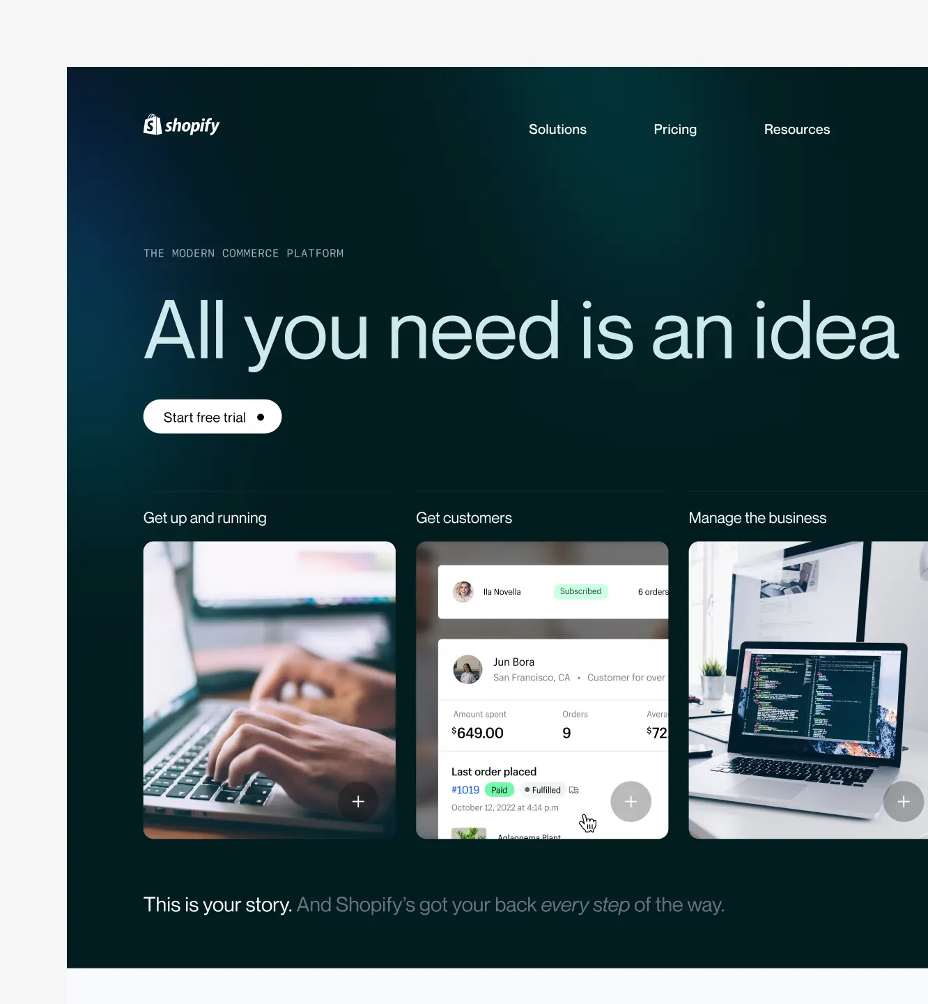
As we worked through early ideas, it became clear that "modern and intelligent" was the best fit for our needs. While the human-centric approach was appealing, it felt a bit too aspirational for what we wanted to achieve. So, we leaned into the modern look while adding touches of warmth and humanity through carefully chosen photography, our hero video, and merchant fake store to make it feel approachable and grounded.
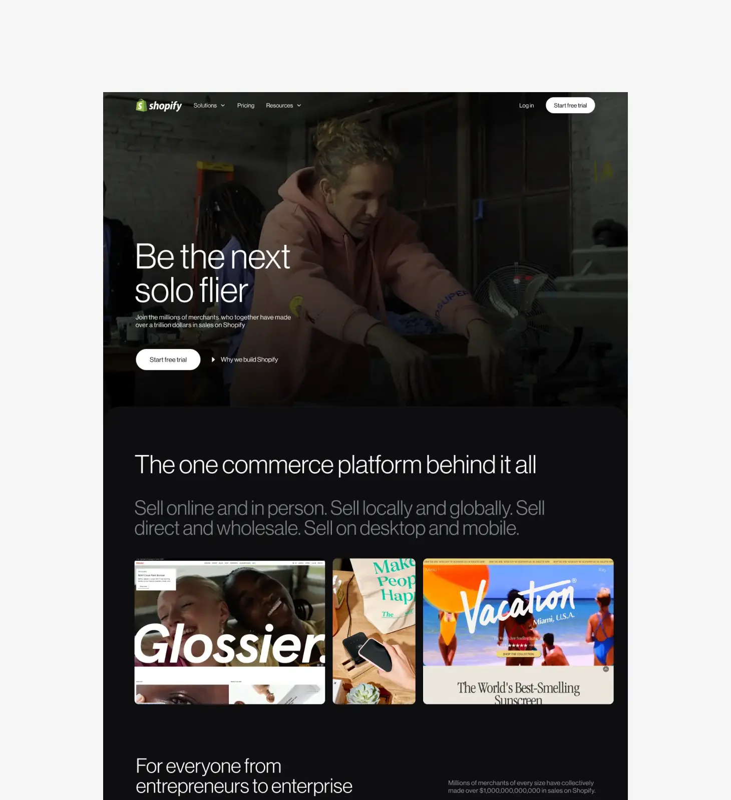
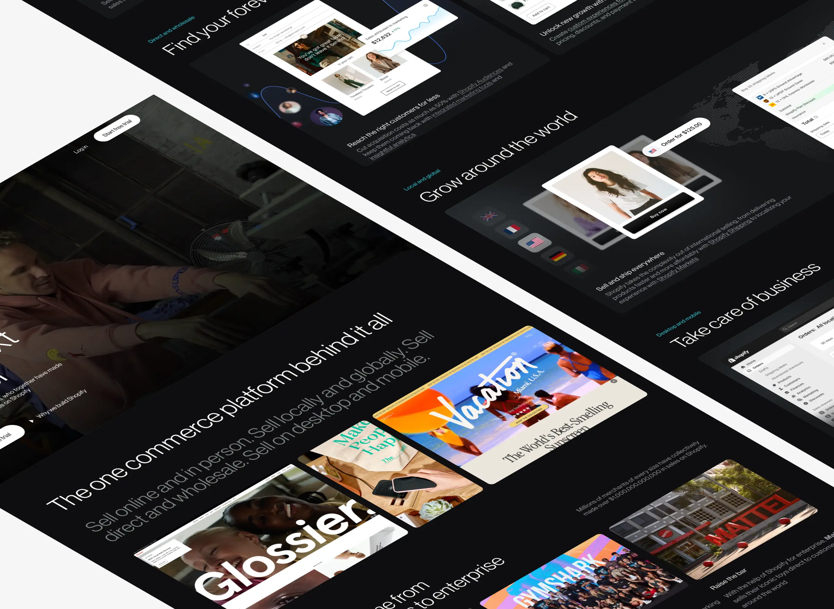
We also chose a "dark mode" style for the homepage, giving it a polished, professional feel that sets the tone for the whole site. The darker, more prominent look distinguishes the homepage, while the interior pages have a lighter design to complement it, almost like child elements. This approach builds on the visual style I’d previously developed for Shopify Storefronts, creating a natural evolution that keeps things cohesive across the brand.
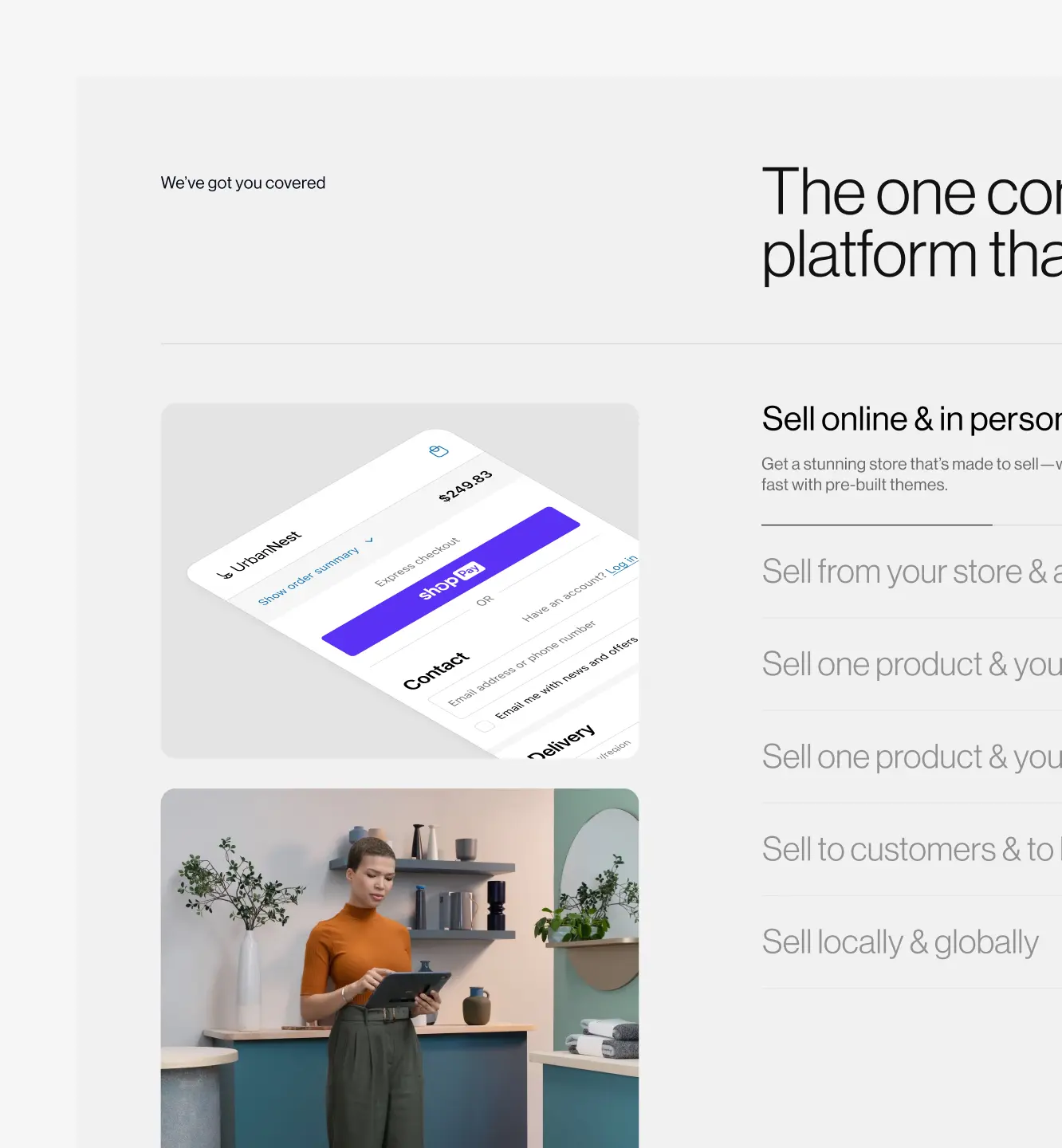
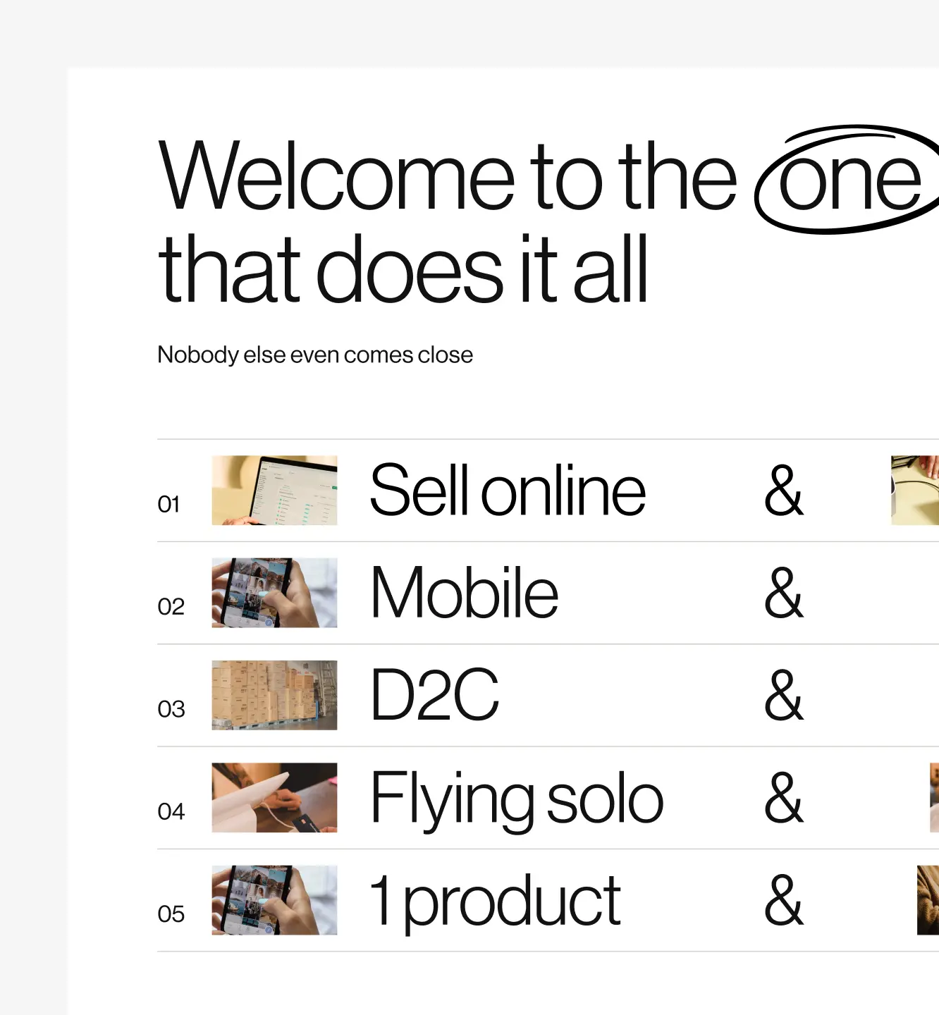
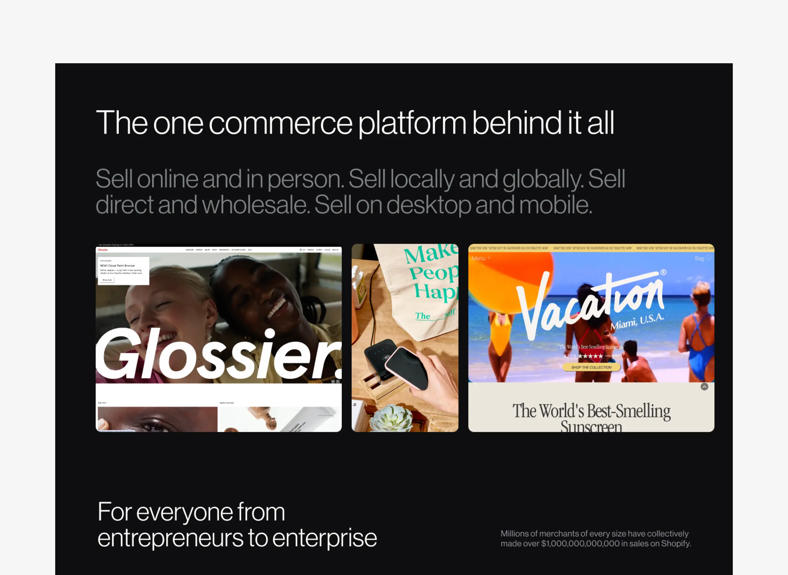
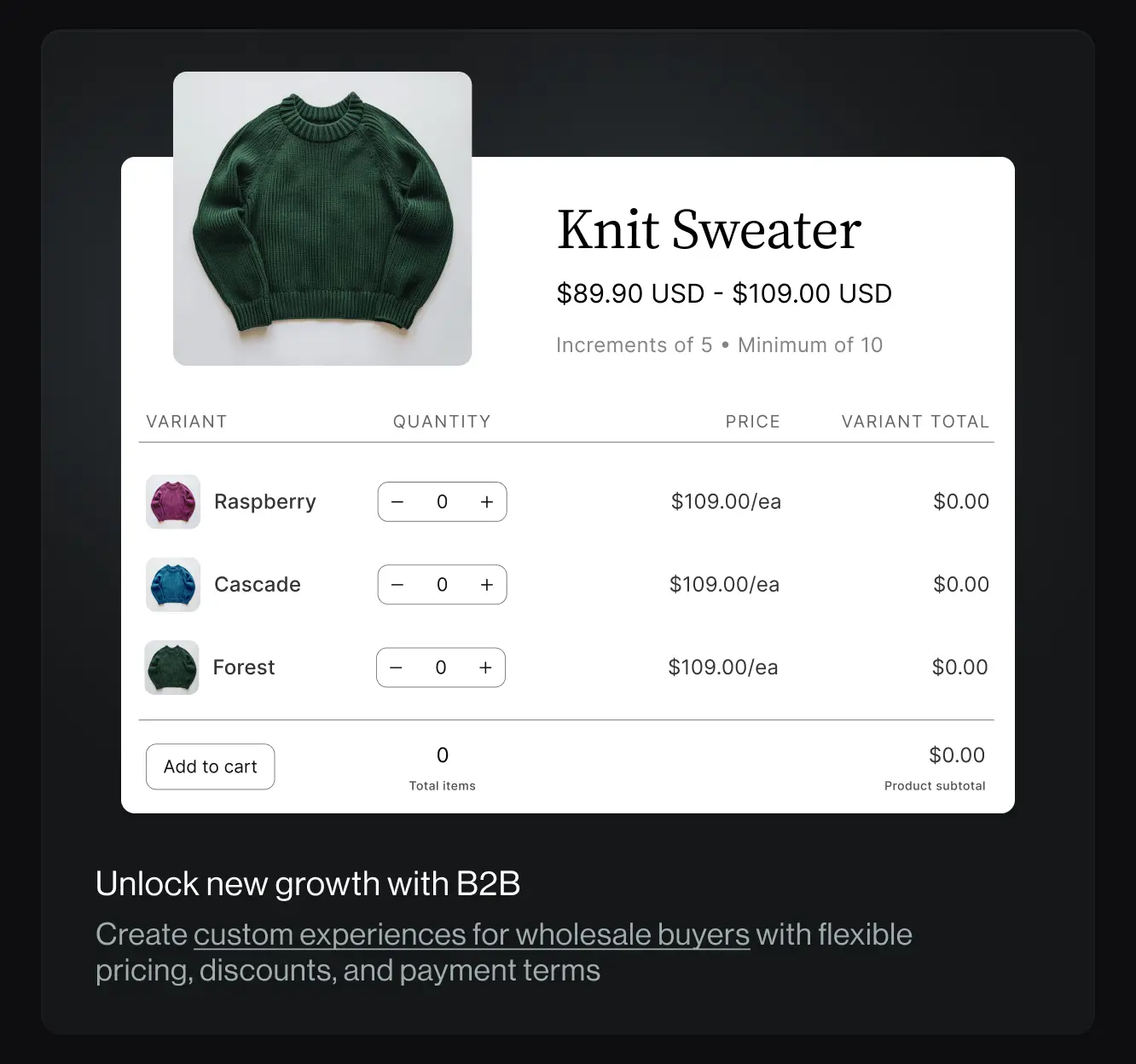
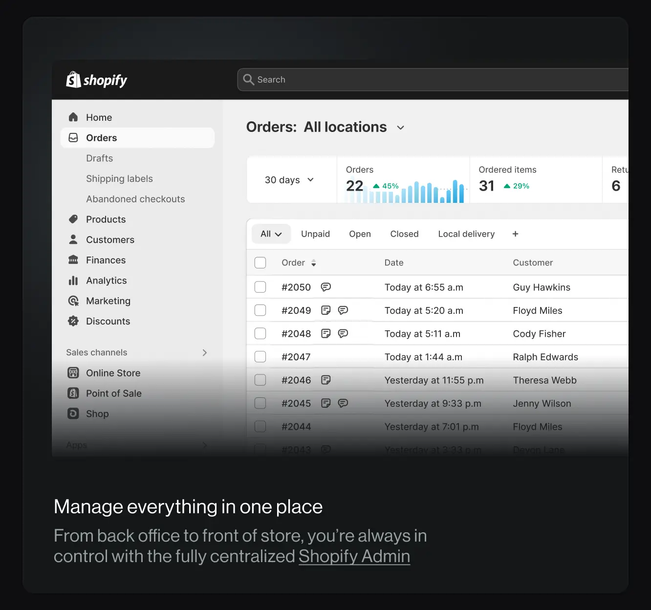
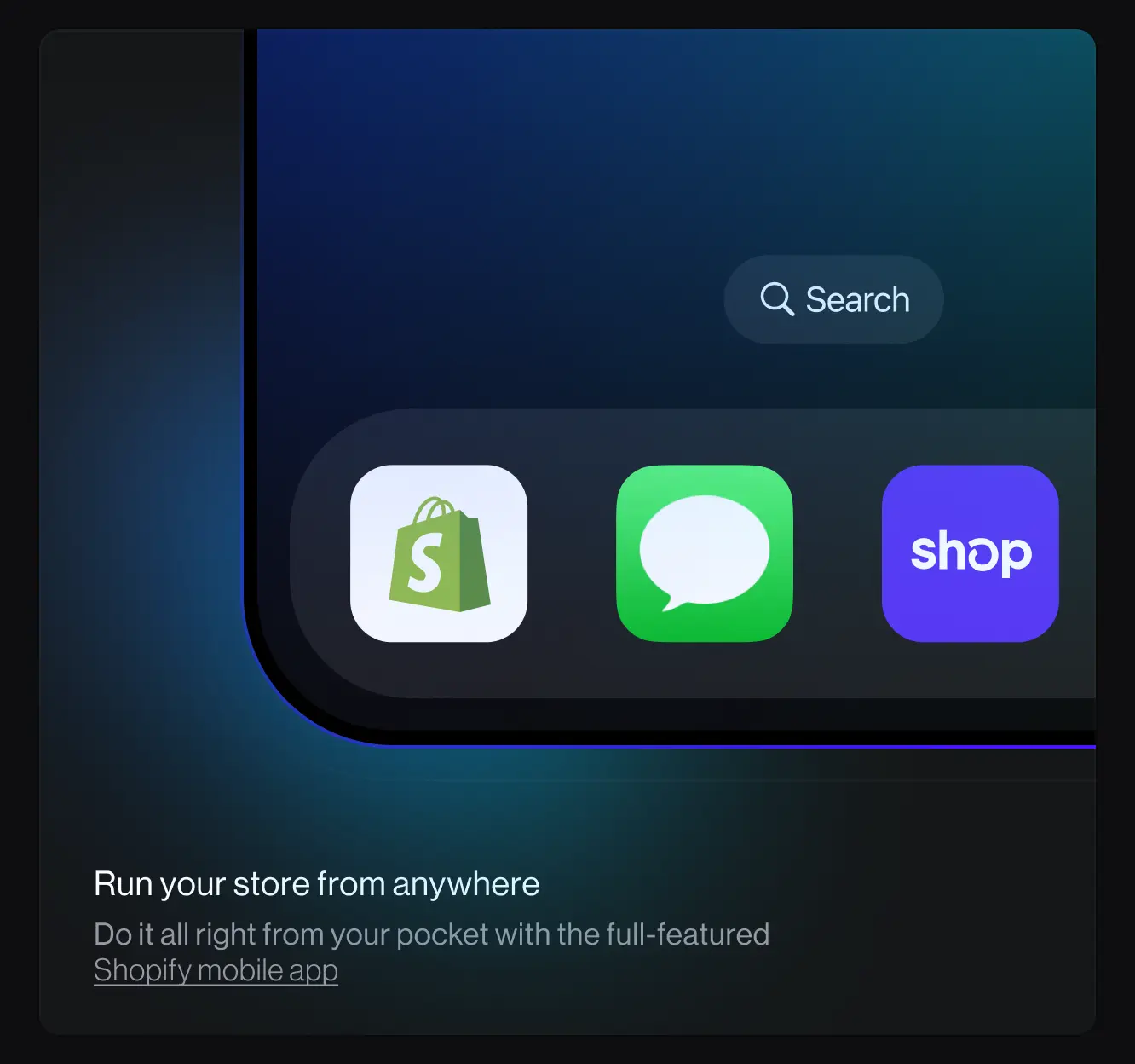
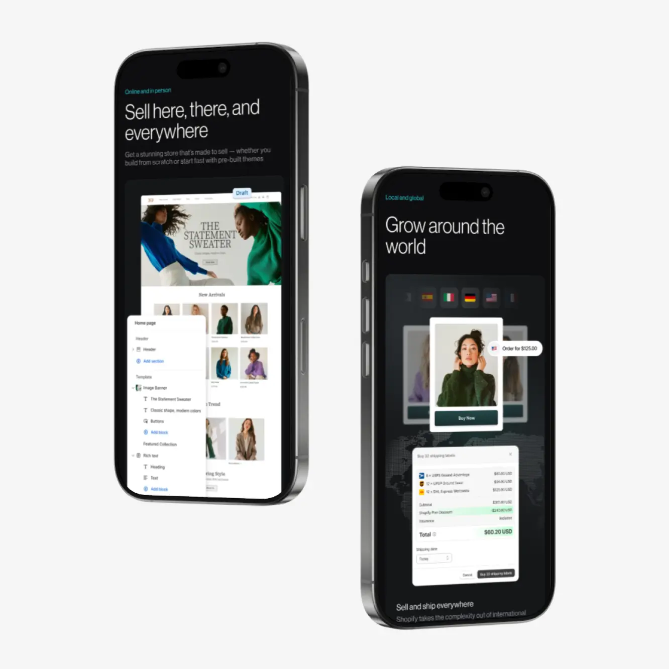
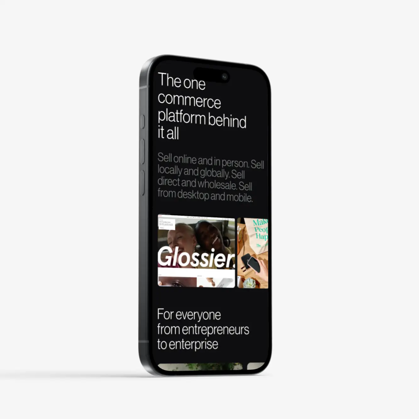
We’re driving home Shopify’s edge over the competition. This section captures the versatility of our platform: whether you're selling online or in person, locally or globally, direct to customers or wholesale, on desktop or mobile, Shopify has everything you need to make it happen. It’s a one-stop platform designed to adapt to every selling scenario, empowering merchants to expand their reach and operate their way—no limitations. This is where we show how Shopify brings every tool together to support growth at any scale.
Product representation
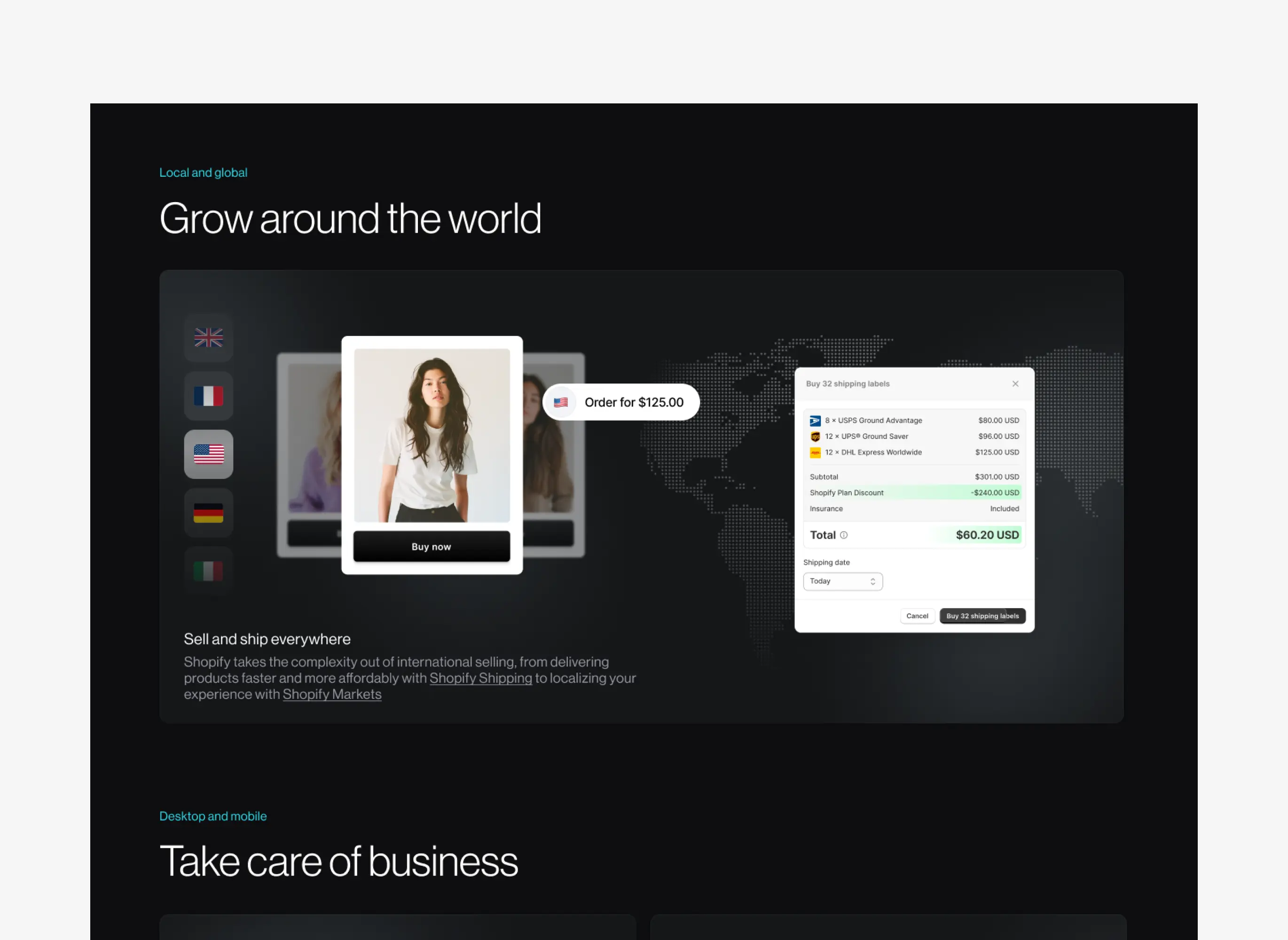
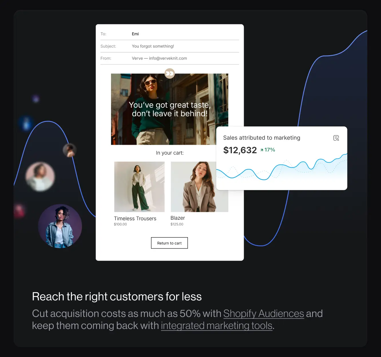
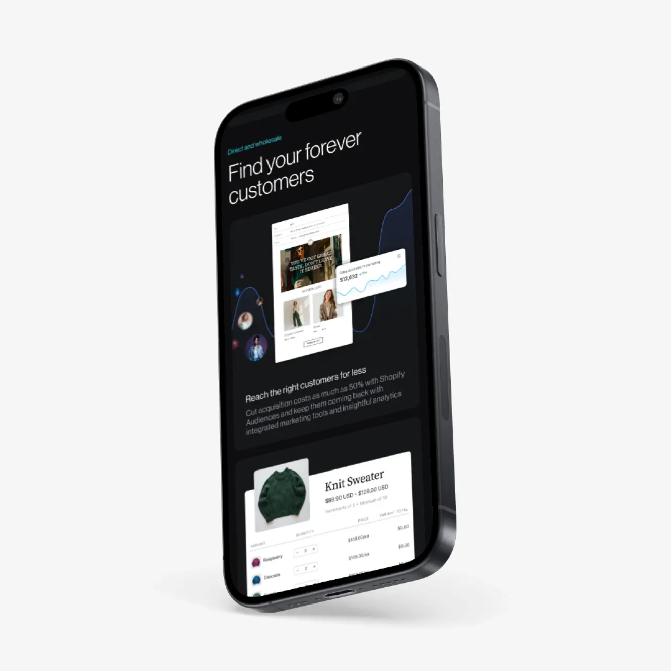
Further on our "show, don’t tell" approach, we introduced interactivity to showcase our products. We used Rive to let users actually play around with different parts of the product, giving them a sneak peek of what they can expect if they choose Shopify for their business. Go ahead and try some out below!
Responsive
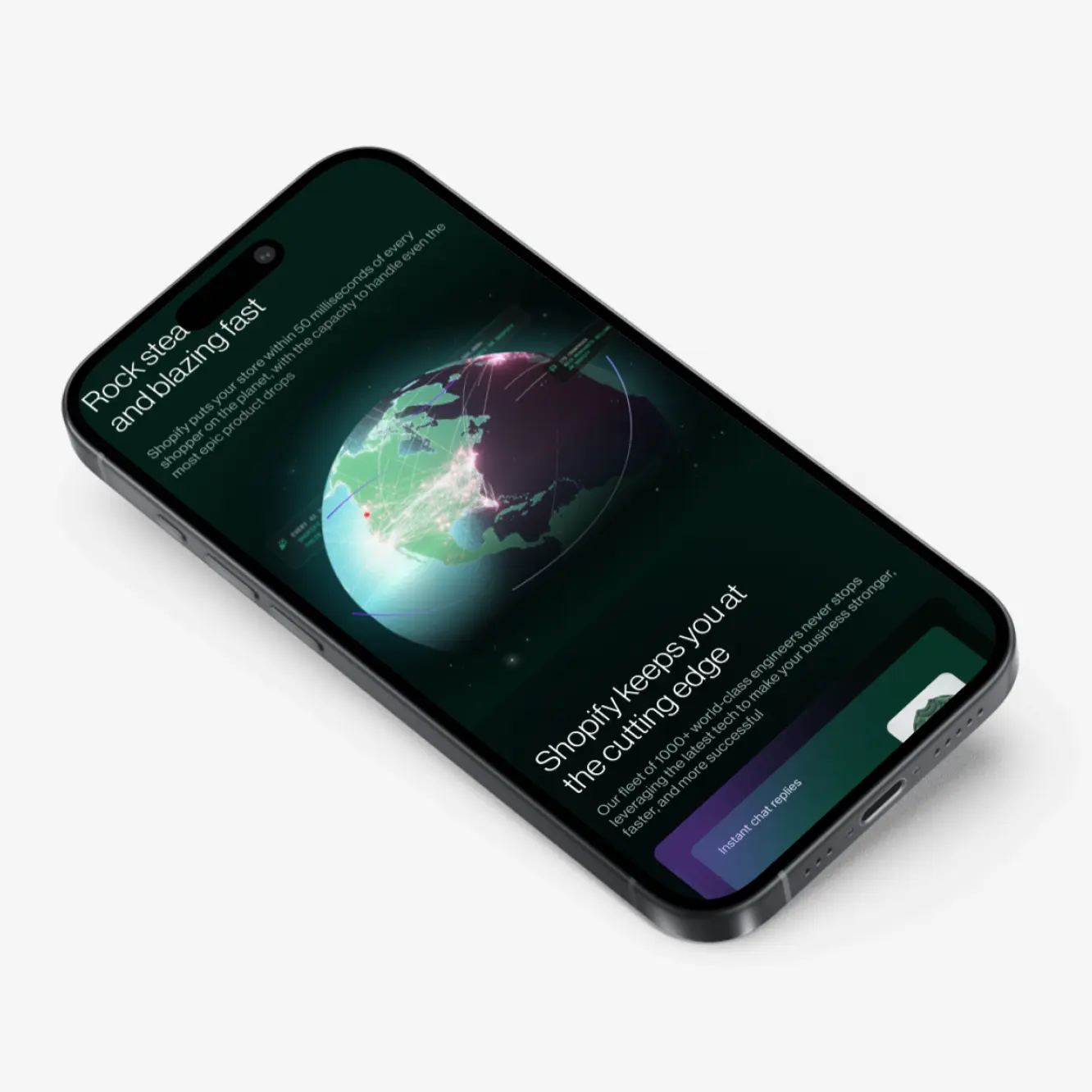
With 55% visitors on mobile, and 45% desktop, we knew getting the mobile experience right was crucial. But we didn’t want to just rely on simple responsiveness. That’s why we tailored the mobile version specifically for mobile users. We made certain parts of the experience different—more cohesive and user-friendly—to help people quickly find the information they need while they’re on the go.
Localization
Since Shopify is a global company, we put a lot of effort into localizing the homepage to make sure our story resonated across different languages and regions. We didn’t just translate it—we fully localized it, adjusting the story for each market. We launched in 33 locales with a homepage that felt tailored for each region, using local images and highlighting companies that made sense in each context.
This process came with its own set of challenges. Responsiveness, for example, was tricky since some languages, like German, use much longer text. It took a lot of finesse to keep things looking sharp across languages.
We also went the extra mile to hyper-localize each version, selecting local merchants and using products that made sense for each locale.
Merchant vetting was also quite a challenge—many didn’t want to be featured, so we had to reach out individually to ensure they were on board and provide legal approval. It was a lot of extra work, but it made the homepage feel truly natural and relevant for every market.
Results
The redesign centers around entrepreneurs, showcasing Shopify as a growth partner for businesses of all sizes, from startups to IPOs. It highlights empathy for the entrepreneurial journey, positioning Shopify as more than just a platform. We’ve crafted a clear, product-focused story that showcases our full offering while staying true to our brand’s DNA. The new homepage is modern, interactive, and designed to motivate action and engagement, reflecting our commitment to continuous improvement and cutting-edge technology. Plus, we’ve localized content with over 18 featured merchants to ensure it feels relevant in key markets around the world.
While our primary intent wasn’t to increase Free Trial conversion, when we A/B tested in an EN segment (CA, AU, UK) the new design outperformed the existing control by 3.11%.
