2021
WEBSITE
Shopify Blog
Role
Lead Designer
Project type
Landing page
My contribution
Art direction
Page layout & design
Experience
Email
Project team
Gregory Ciotti, Tyler Noseworthy, Leila Courey, Andrée Rouette, Kyle Risley
Visit Site
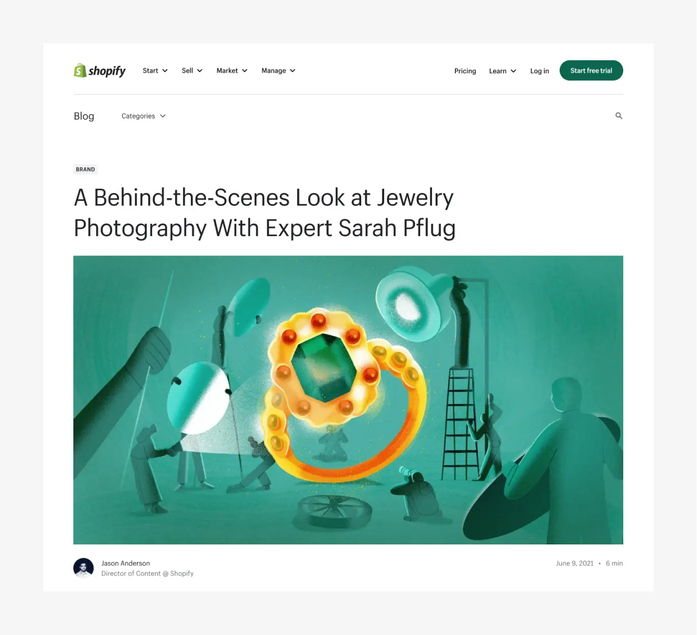
In September 2021, the Growth UX team at Shopify set out to reimagine our blog, which hadn’t seen a major update in eight years. We saw several opportunities to make improvements, especially on the article page, which felt cluttered and lacked a clear sense of hierarchy. It was busy and made it difficult for readers to find what they needed.
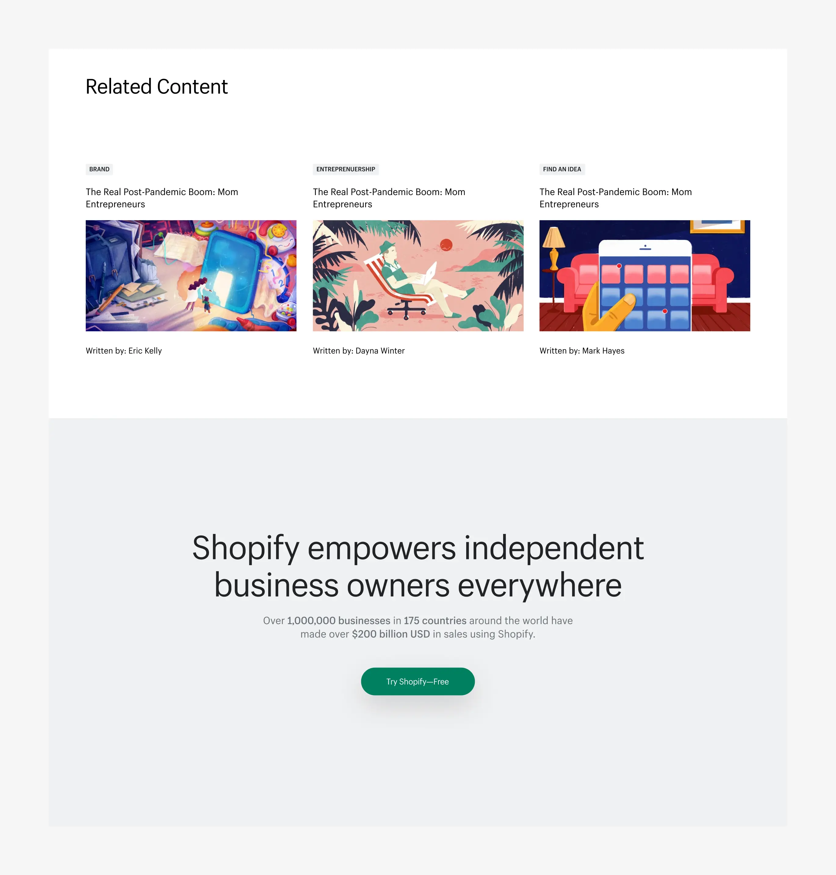
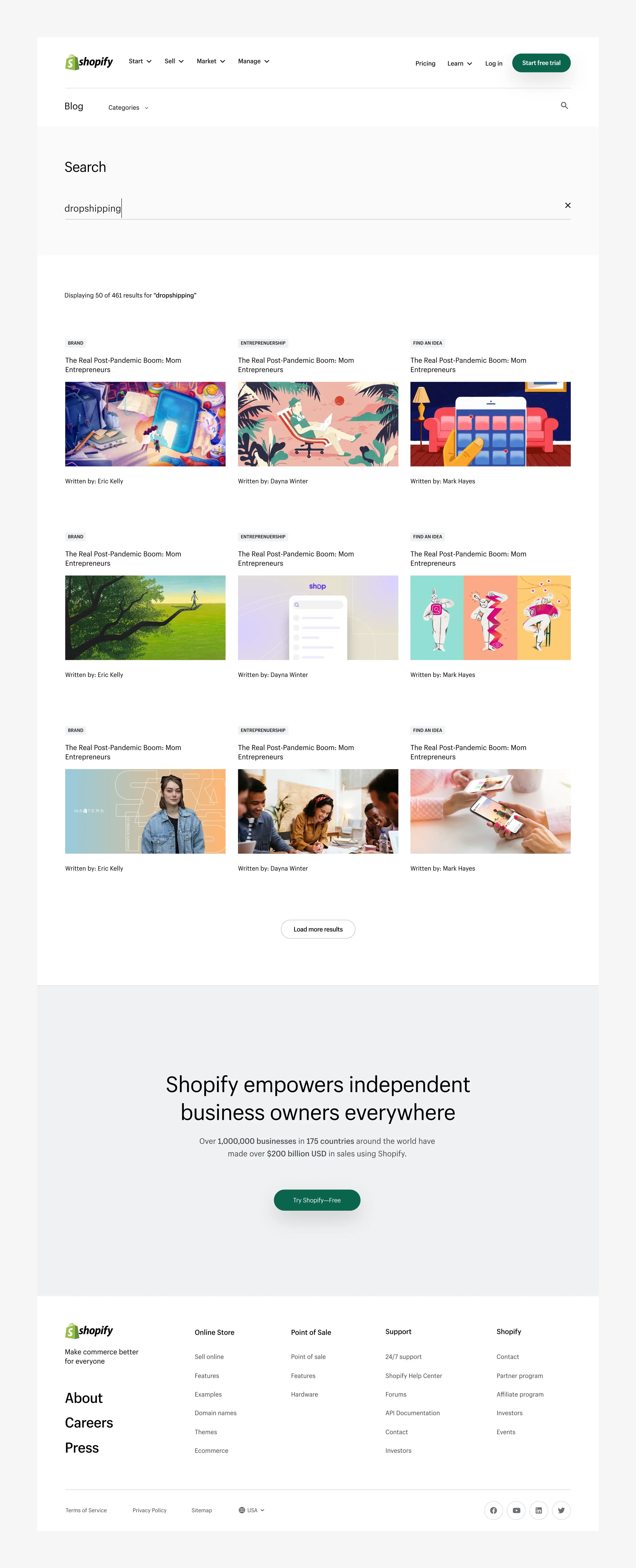
Our hypothesis was that by removing sidebar links, putting a stronger focus on content, improving navigation, and giving the design a fresh look, we could boost content engagement, increase time on page, and improve our S2L. We approached this as a v1 experiment, starting with the article page (our most-viewed) and planning to revisit the homepage and other internal pages down the line.
Hero exploration
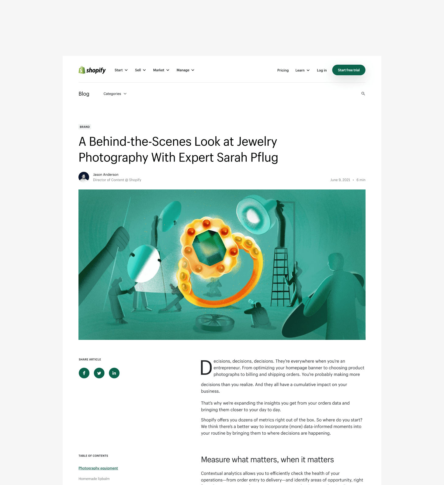
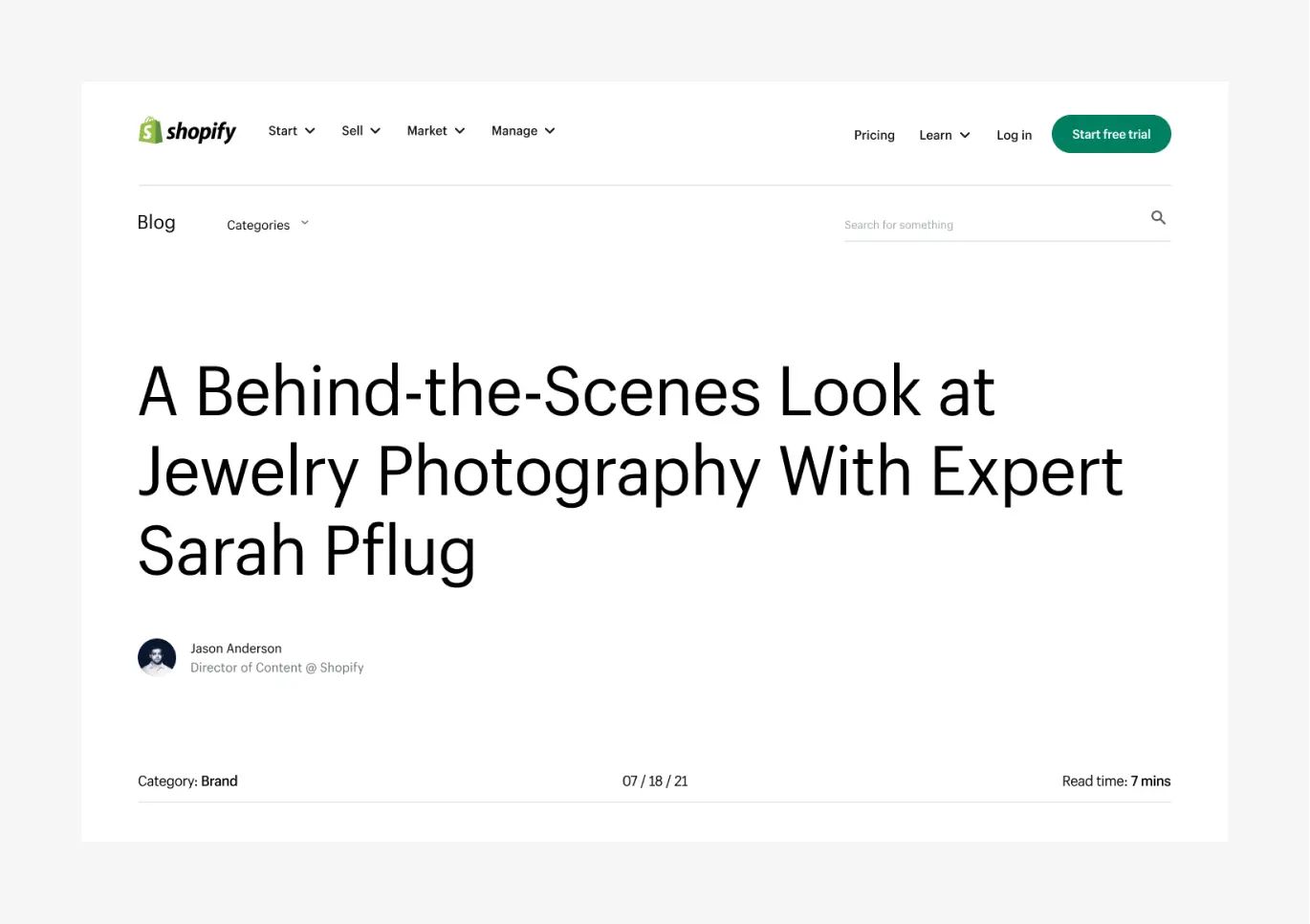
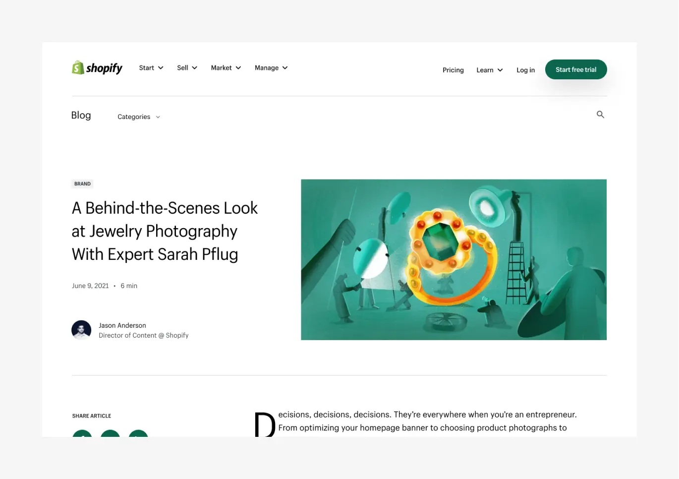
We explored a bunch of different hero options, but one thing was clear: we work with some incredible artists, and we wanted their artwork to take center stage. So, we landed on a design that does exactly that—putting the artwork front and center.
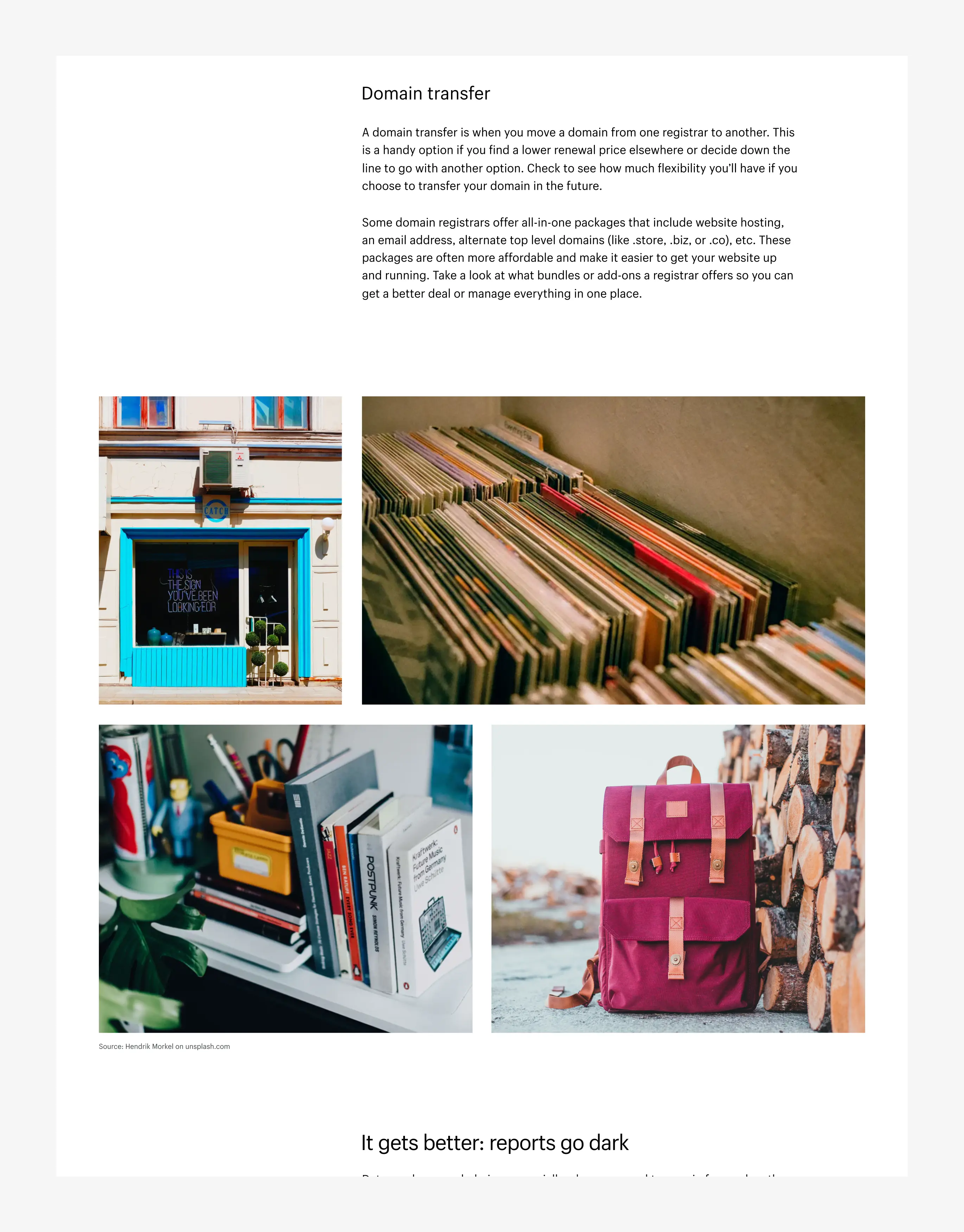
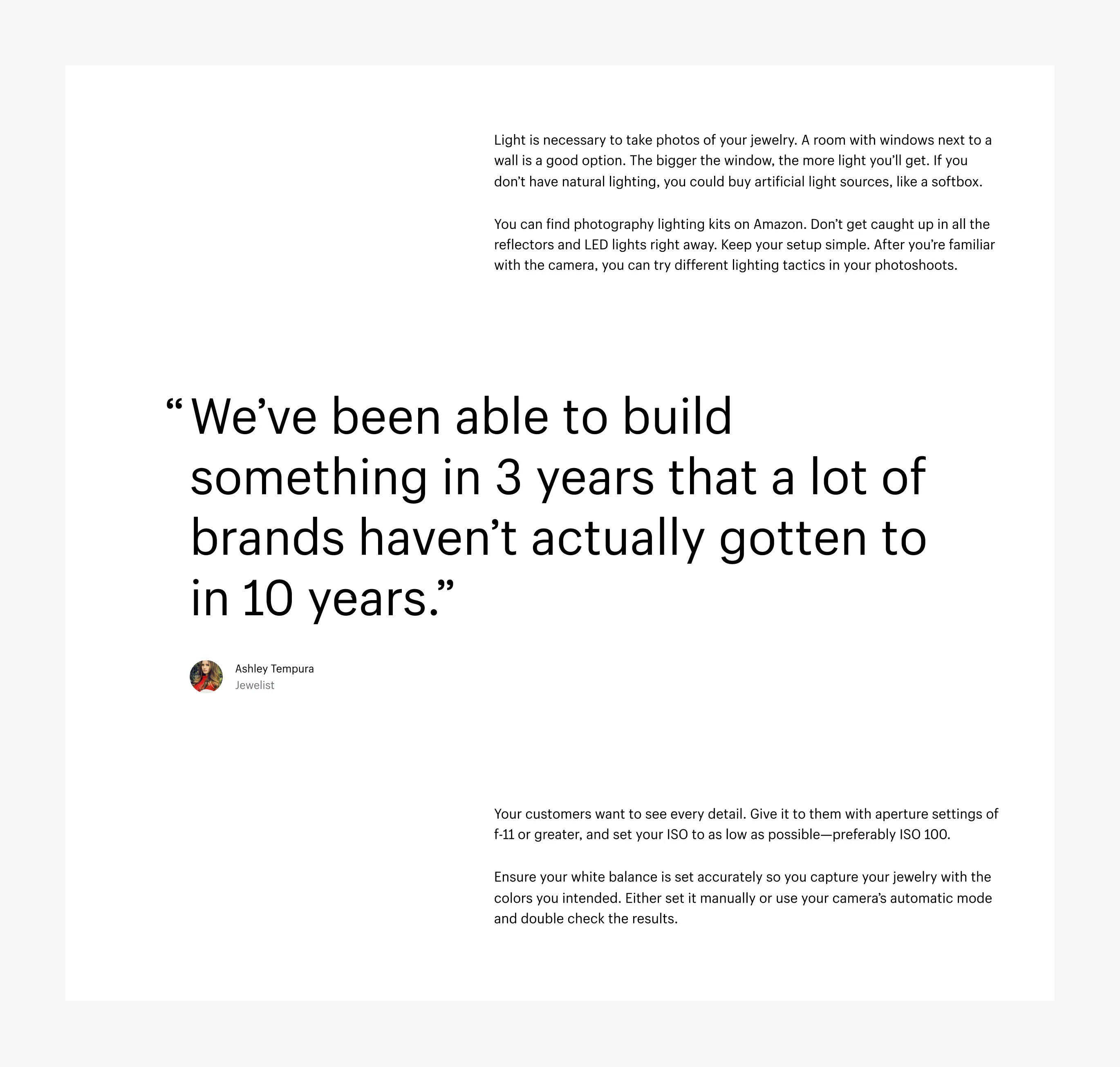
Components
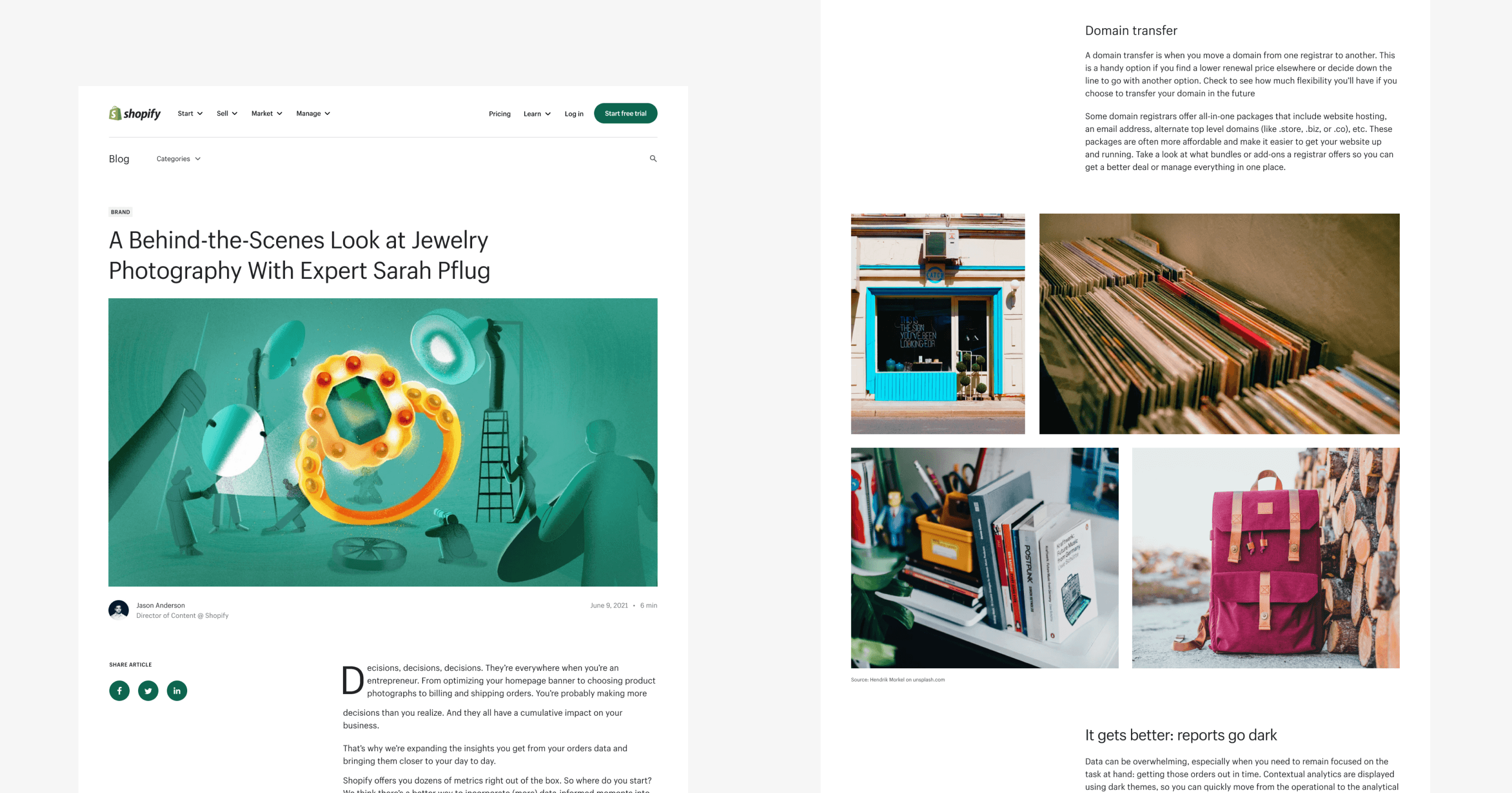
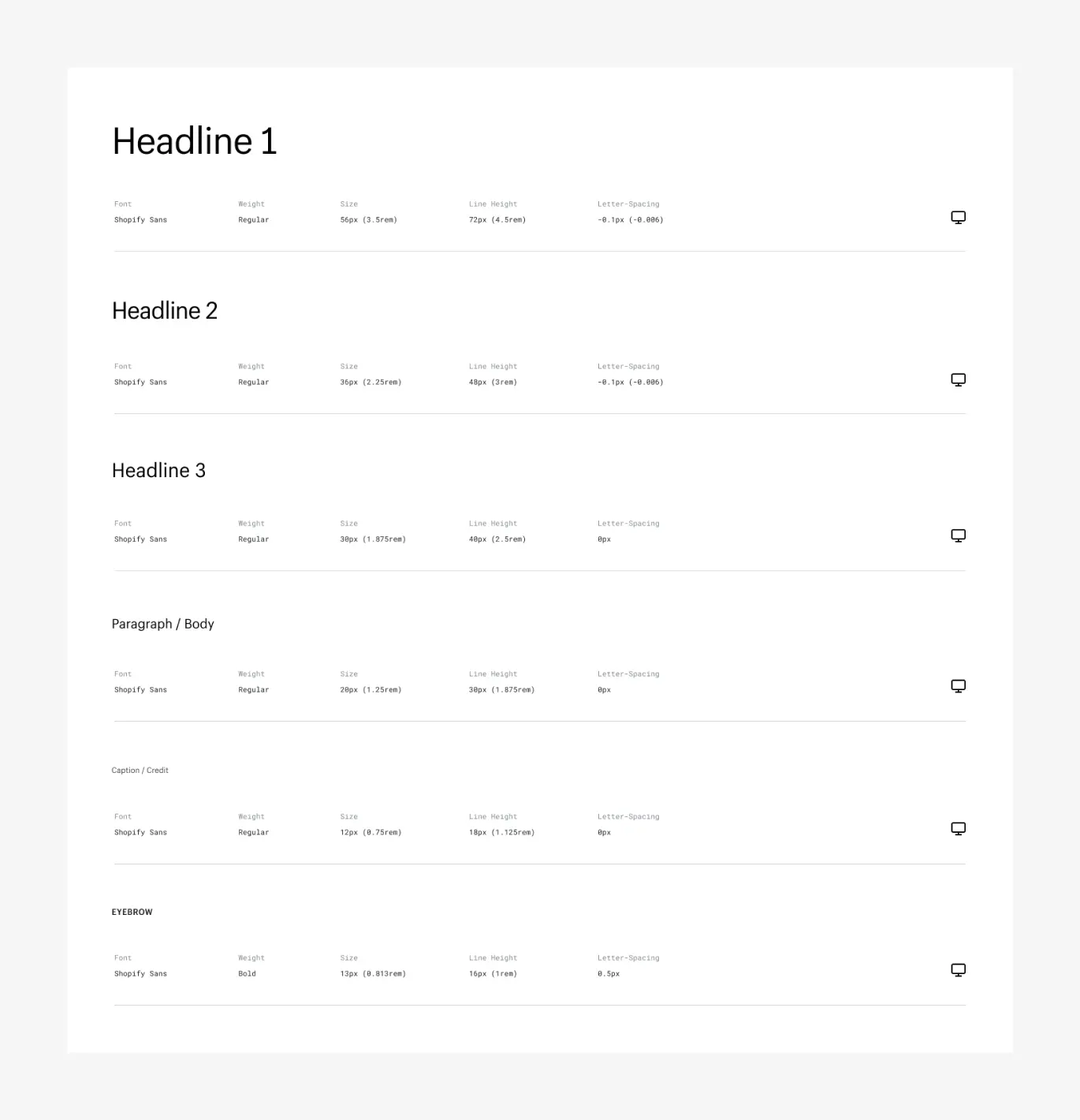
One issue the blog team mentioned was their limited freedom with adding images, videos, sound clips, tables, lists, and more. So, with scalability in mind, we designed a set of reusable components that could be used across the entire system, giving them way more flexibility.
